Typography
Thoughtful typography is important to establish visual hierarchy and clearly and efficiently communicate content.
Typefaces
We use Roboto Flex for our interfaces. This variable font includes a full range of weights and renders well across multiple devices and resolutions.

Additionally, Roboto Mono is used for situations where a monospace typeface is needed.

Roboto Flex and Roboto Mono can both be downloaded from Google Fonts.
Font size
The Jack Henry design system provides a type scale that includes a scale of 18 steps that increase in size to allow for flexibility and typographic contrast when styling body and display type.


Line height
A 17-step scale of line heights that increase in size is provided to create pleasing vertical rhythms and allow for appropriate readability. Font concepts have specific font size and line height pairings, but other line heights can be leveraged to fine-tune vertical spacing.


Weight
Font weight can help add emphasis and content hierarchy when thoughtfully applied. A scale of four weights is included as part of the typographic system. These weights correspond to the same numerical designation within the CSS spec.


Italics
Italics are available for body text across each weight. Use italics to create emphasis on short spans of text.

Concepts
The design system includes a collection of semantic concepts that have pre-define pairings of size, line height, and weight. These alias tokens should be used to create consistent, well-structured content and data throughout an application.
Micro
Micro is used for "fine-print" text and small snippets of text with limited space within a component.

Helper
Helper is used for secondary or explanatory text. It is also used for field labels.

Body
Body is used for blocks of text and most content displayed within components. There are two steps within the scale. The first step is used for the vast majority of body content. The second step is used for shorter spans of text that need more emphasis or hierarchy such as a page lead.


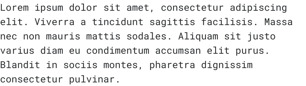
Code
Code is used for code references in standard blocks of text. Similar to the body concept, there are two steps within the scale. Each step pairs with that of the body concept. The first step is used for most inline and blocks of code. The second step is primarily used when code needs to referenced within or alongside the second scale of body text.

Heading
Heading is used to create visual hierarchy on a page and within a component. The heading scale includes size steps which increase in size.


Display
Display is used to create visual emphasis through size without being misconstrued as a heading. There are three steps within the scale that increase in size.