Radio group
Radio groups display a related set of options where only one option can be selected.
Code documentation
Anatomy
The radio group component is made up of six elements.
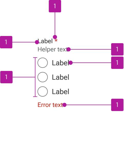
- Label
- Required indicator
- Helper text
- Control
- Default slot
- Error text
Variants
Label
Radio groups can include a label that describes the related controls.
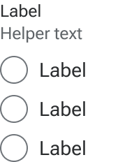
Helper text
Helper text can be included to convey additional information about the controls.
Default slot
The default slot accommodates any number of radios that are contextually related.
Required indicator
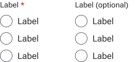
Radio groups can be marked as either required or optional which triggers relevant validation on the form. The indicator is a preset and styled element within the component, not manually entered as part of the label string.
Required form elements are used when the majority of the form elements are optional, but a few need to be marked as required.
Optional form elements are used when the majority of the form elements are required, but a few elements need to be marked as optional.
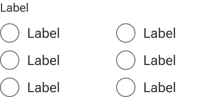
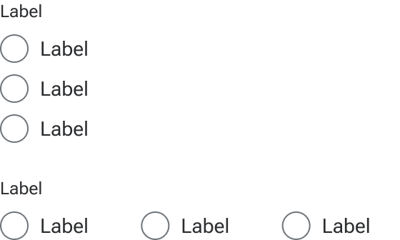
Orientation
Radio groups can be either vertical or horizontal depending on the layout requirements of the user interface. The default orientation is vertical.
Behavior
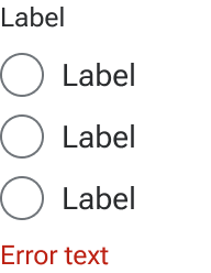
Invalid
An invalid state can be triggered on radio groups to indicate that a value needs to be entered or that the entered value is invalid. Error text is always displayed as part of the invalid state to allow for a generic error message or provide specific guidance as to what needs to be fixed. Error text is always displayed in addition to any helper text that is present and below the default slot.
Text overflow
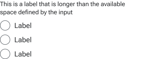
Label
Label text that is longer than the available space wraps to a new line.
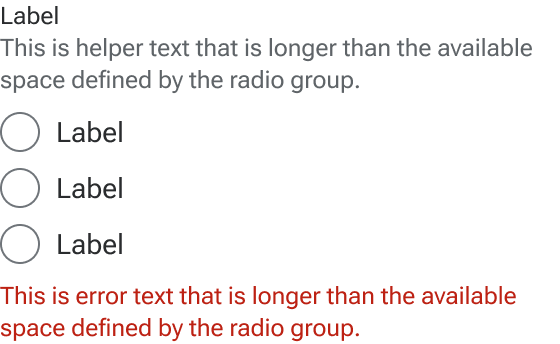
Helper and error text
Helper and error text wrap to a new line when they are too long for available horizontal space.
Figma
Required and optional indicators
Figma currently doesn’t allow multiple objects to naturally wrap inline. As a result, the label horizontal resizing changes to hug when showIndicator is turned on. This may cause the label to break out of the container. There are a few ways to visually fix this limitation:
- Rewrite the
labelso it is shorter and no longer wraps. - Resize jh-checkbox-group to prevent the
labelfrom wrapping. - Manually add the indicator to the label text and style as appropriate. (This will require clarification for developers since this is somewhat of a hack.)
- Leave the indicator turned off and note in the spec how it needs to be set when implemented.
Multiple controls
To balance most use cases with a visually streamlined component, the radio group displays three radios by default with an additional seven hidden. You can manually show any of the additional radios as needed. If there are circumstances where you need more than ten radios or a different arrangement (such as multiple rows), you can create a new layout with the number of radios needed, componentize it, and replace the default instance with your custom version.
Disabled states
Currently, disabled states must be set on the individual control, not the radio group. To convey disabled radios, drill down to the nested radio-group-control layer and change the state property to disabled.