Toast
A toast is a temporary notification that informs users on the outcome of an action.
Code documentation
Anatomy
The toast component is made up of two elements.
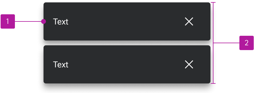
- Notification
- Default slot
Variants
Appearance
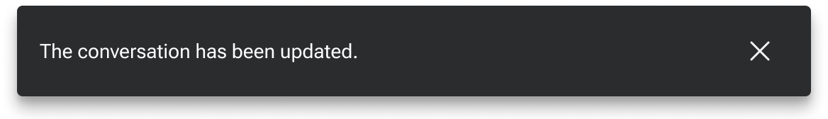
Neutral
Neutral toasts are used in contexts that are largely informative and have no positive or negative connotation.

Positive
Positive toasts are used in contexts that convey a positive connotation such as approved, complete, and deposited.

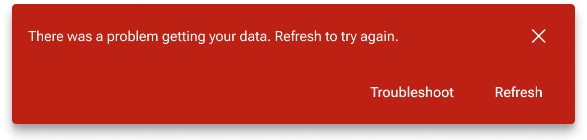
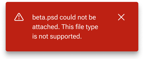
Negative
Negative toasts are used in contexts that convey a negative connotation such as error, alert, or rejected.

Icon
A user-customizable icon can be paired with the text for increased visual emphasis.
Dismiss button
An icon-only dismiss button can be included to clear the toast. The icon is user-customizable.
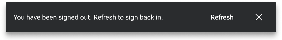
Action buttons
Buttons can be used to provide the user a contextual action.
Stacked
By default, action buttons are in line with the text. However, they can be stacked below the text in situations where either the text or the button label are relatively long.
Behavior
Dismiss
Toasts are set to auto-dismiss after five seconds by default, but they may be manually dismissed if needed. The user can adjust the timeout that denotes when the toast will dismiss as well as set it to a value that will functionally disable auto-dismiss.
Text overflow
Notifications resize to fill the width of the toast container. Text within each notification wraps according to the default notification text overflow behaviors.
Controller
The following additional toast behaviors are handled by a separate toast controller component.
Placement
When triggered, the toast controller places the toast in the bottom-left corner of the viewport. This placement is “sticky” to ensure the toasts remain anchored to the bottom-left of the view even when scrolling. The z-index for individual toasts as well as the controller itself can be redefined to help control the layer of elements within the view.
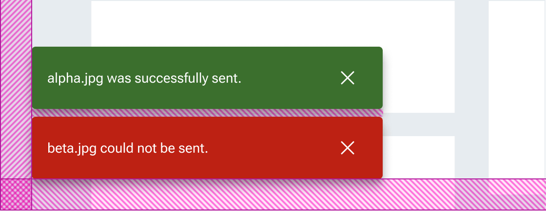
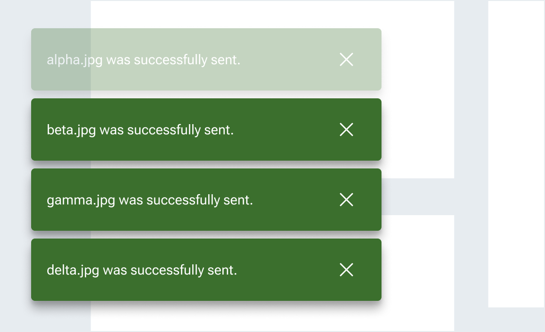
Multiple toasts vertically stack with the newest notification occupying the bottom-most position. Previous notifications are pushed up maintaining the preset spacing until they are either manually or automatically dismissed.
Max count
A max count can be set to determine the maximum number of toasts that can be displayed at a time. When a toast is added past the max count, the oldest toast at the top of the stack automatically dismisses. The default max count is three, but it can be adjusted by the user.
Figma
Custom max-count
The toast includes a base layout that shows up to four notifications at one time. This base layout can readily be swapped with custom maxCount layouts as needed.