Tooltip
Tooltips provide contextual information when a user hovers over a related element.
Code documentation
Anatomy
The tooltip component is made up of three elements.
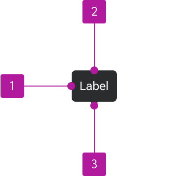
- Container
- Label
- Arrow
Variants
Position


Behavior
Timing
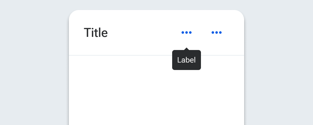
The tooltip becomes visible upon hovering over or tapping and holding the related element and should remain visible for as long as the user hovers over or long-presses the element.
Placement
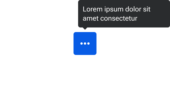
Where possible, the arrow of the tooltip should be centered with the element it’s describing. The tooltip should have 4px space between the tip of the arrow and the container of the described element (or space occupied by line-height for text elements).

The default behavior is for tooltips to flip to the opposite side when constrained by space. For example, a tooltip placed at the top of an element by default should flip to the bottom once the page scrolls to where the tooltip would be cut off by the top of the viewport. Similarly, right-positioned tooltips would flip to the left and vice-versa.
Width
Tooltips have a maximum width of 160px. Once text reaches the maximum width, it wraps to a new line and the tooltip container adjusts its height away from the arrow.