Tag
Tags represent keywords, categories, or other labels that serve to classify adjacent content.
Code documentation
Anatomy
The tag component is made up of four elements.
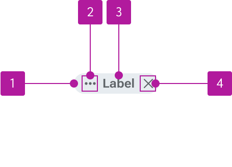
- Container
- Icon
- Label
- Dismiss button
Variants
Label
The label conveys what the tag represents. Tags should always have a label present.

Icon
An icon can be inserted to the left of the label to visually compliment the label. Tags should never be used with just an icon.
Dismissible
Tags can be dismissed such as when using them within filters or search refinements. The dismiss button has its own set of interactions and states so it can be interacted with independent of the tag itself. The dismiss icon may be customized as needed.

Size
Tags come in two different sizes to accommodate various placements.
Small
Small tags are the default and can be used in a variety of contexts and space constraints.

Medium
Medium tags are slightly more generous in height. These are best reserved for areas of the UI that include ample whitespace and fewer overall tags within a group.

Behavior
States
Interactive tags have a variety of states built in. Tags can be made interactive by setting a URL in the href property. Alternatively, a tabindex may be added to the tag. Since interactive tags are primarily intended to link to other pages, there is no disabled state available.


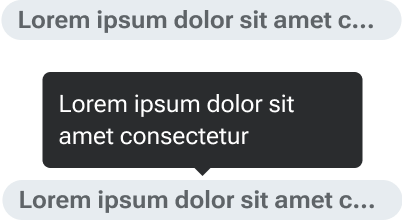
Width
Tags have a default maximum width of 200px. Label text that overflows the container is truncated with an ellipsis once it reaches the maximum width. A tooltip displays the full text when a user hovers over the label. The maximum width may be adjusted via component token as needed.