Switch
A switch allows users to select between one of two opposing states or options.
Code documentation
Anatomy
The switch component is made up of four elements.
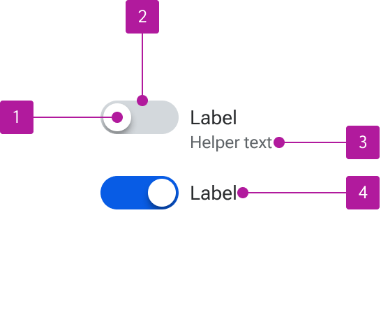
- Thumb
- Track
- Helper text
- Label
Variants
Label
Labels are not required if an adjacent label is included that adequately describes the purpose of the switch and is correctly referenced to the field for accessibility purposes.

Helper text
Helper text can be included alongside the label to provide additional context or guidance for using the control.

Behavior
Text overflow
When labels wrap to multiple lines, the first line of the text remains vertically centered with the control. Helper text simply wraps to the next line.

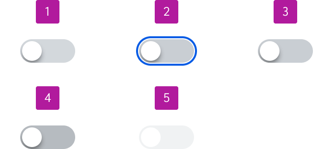
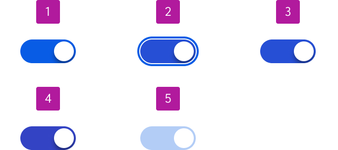
States
Switches can be either unselected or selected. Each of those statuses has five states:
- Enabled
- Focus
- Hover
- Active
- Disabled