Notification
A notification communicates to a user timely or important information.
Code documentation
Anatomy
The notification component is made up of five elements.
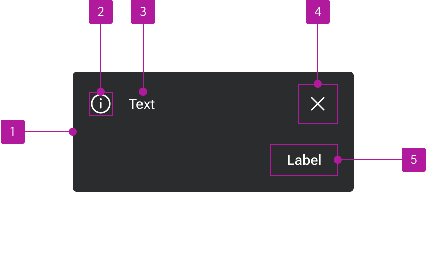
- Container
- Icon slot
- Default slot
- Dismiss icon slot
- Action slot
Variants
Type
Alert
Alerts appear as block-level elements anywhere within the normal flow of content.
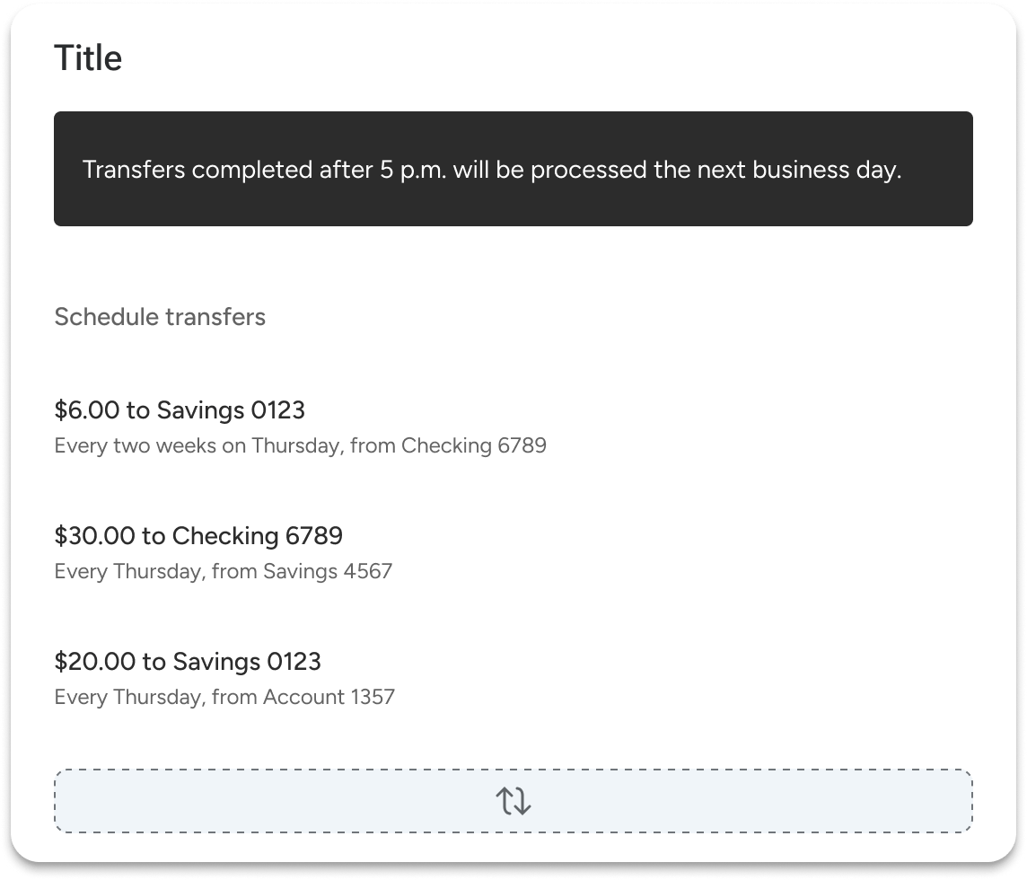
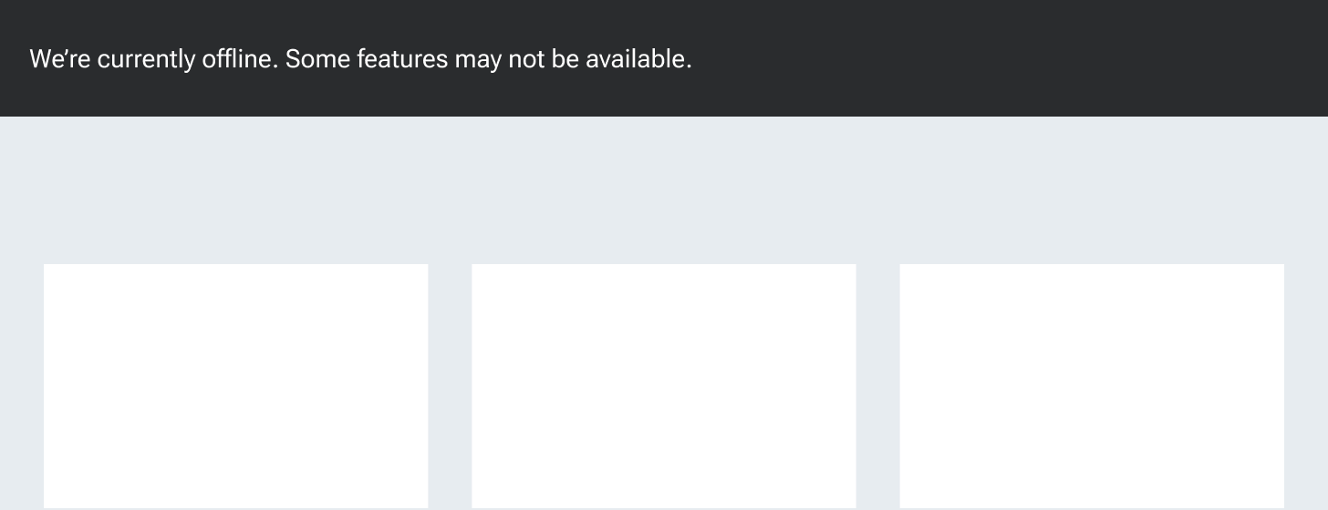
Banner
Banners are able to break out of the standard flow and go edge-to-edge within a container, even if padding is applied. Banners can be used to make the notification feel more integrated with its parent component or as a way to handle application-wide notifications at the top of the screen.
Appearance
Neutral
Neutral notifications are used in contexts that are largely informative and have no positive or negative connotation.

Positive
Positive notifications are used in contexts that convey a positive connotation such as approved, complete, and deposited.

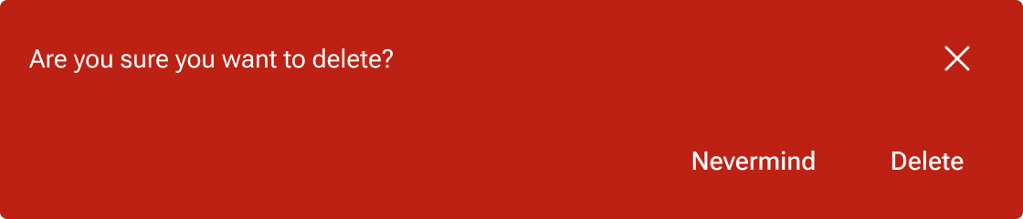
Negative
Negative notifications are used in contexts that convey a negative connotation such as error, alert, or rejected.

Icon
A user-customizable icon can be paired with the text for increased visual emphasis.
Dismiss button
An icon-only dismiss button can be enabled in the top-right to clear the notification. The icon is user-customizable.

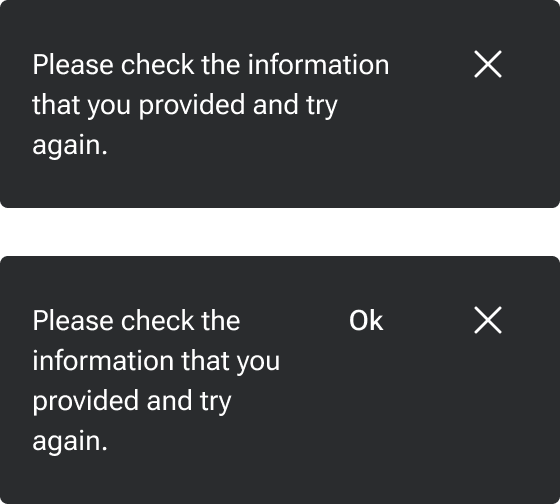
Action buttons
A series of buttons can be placed side-by-side within the notification to provide the user contextual actions.

Stacked
By default, action buttons are in line with the text. However, they can be stacked below the text in situations where either the text or the button label is relatively long.
Behavior
Text overflow
The default slot expands to fill the available space of the notification container not already taken up by the action buttons and dismiss button. Within the default slot, text wraps to form another line when it is too long for the available space.
Figma
Buttons
The notification component includes a close button as well as a slot for action buttons. The action slot can be customized to include various button layouts as needed. The Figma component comes with a default layout of two buttons.
If you need to customize your own action area, use the base notification buttons instead of the default Forge button. The notification buttons represent styling overrides that are in place to ensure appropriate color contrast against the notification backgrounds.