Button
Buttons enable a user to initiate a specific action.
Code documentation
Anatomy
The button component is made up of four elements.
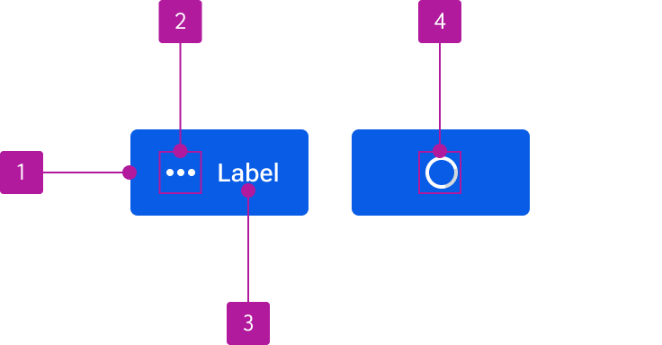
- Container
- Icon
- Label
- Progress
Variants
Label
The label conveys the button’s action. Keep button labels concise and action-driven.
Icon
An icon can be included alongside a label to provide additional visual context or by itself in compact layouts. Always ensure the icon’s meaning is clear and compliments the text label.
Icon-based buttons should be selectively used to avoid unnecessary visual clutter. Additionally, they should include a tooltip to help clarify the meaning as well as provide relevant text to a screen reader or other assistive device.
Icon position
Icons can be placed on either side of the label with the left position being the default. Use left icons to emphasis a button’s meaning and right icons to imply a progression or directionality.
Appearance
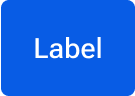
Primary
Primary buttons call attentions to the strongest call to action within a particular context or view. These should generally appear only once per container.

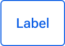
Secondary
Secondary buttons are the default button appearance and often used alongside a primary button to indicate a secondary action such as “Cancel.” They can also be used for most non-critical actions.
Tertiary
Use tertiary buttons for less prominent or independent actions. Tertiary buttons can also be paired with a primary button when there are multiple calls to action.
Danger
Danger buttons convey destructive actions such as “Delete” or “Remove.” To avoid confusion, do not use danger buttons for any type of action other than a destructive one.
Size
Buttons are available in small, medium, and large sizes. These sizes coordinate with comparably-sized inputs and should be used as such when building forms to ensure consistent alignment.
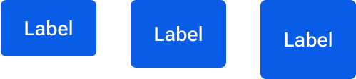
Small
Use small buttons where vertical space is limited or when paired with other content that is similar in height.
Medium
The medium size is the default and used for most button instances.
Large
Use large buttons in limited cases where a button needs to pair with a larger element or have particular prominence. Typically, a large button should be limited to one per view.
Block
By default, a button’s width is dependent on the label and/or icon contained within it. However, a block button expands to fit the width of its surrounding container. Buttons can be set as a block variant at any size. Use when vertically stacking multiple calls to action in a container such as a card or dialog.

Behavior
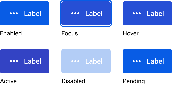
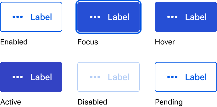
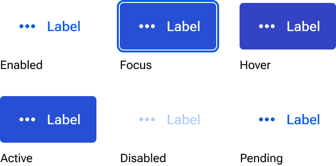
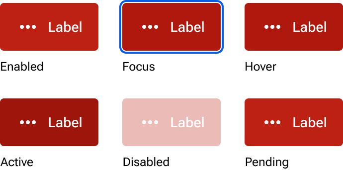
States
Each button appearance has six available states: enabled, focus, hover, active, disabled, and pending. The pending state replaces the label and icon with a progress indicator to show that a process such as saving is taking place.
Figma
Custom sizes
The size of the button component can be customized to accommodate unique circumstances that aren’t readily supported by the stock sizes. Make the following adjustments to a button instance to allow for manual resizing:
- Select the jh-button layer.
- Change the sizing constraints for the height from hug to fixed.
- Select the button-wrapper layer.
- Change the sizing constraints for the height from fixed to fill.
- Resize the jh-button layer as needed. The width should still automatically resize to accommodate the length of the label and icon (if present).
Additionally, you can componentize your resized instance and add it to your product library for reuse across your UI. These custom sizes can be conveyed to engineering by redefining the button’s size token in a spec.