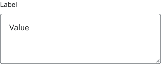
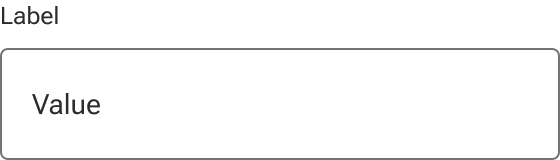
Input
An input is a field that allows a user to enter and interact with text and numeric values.
Code documentation
Anatomy
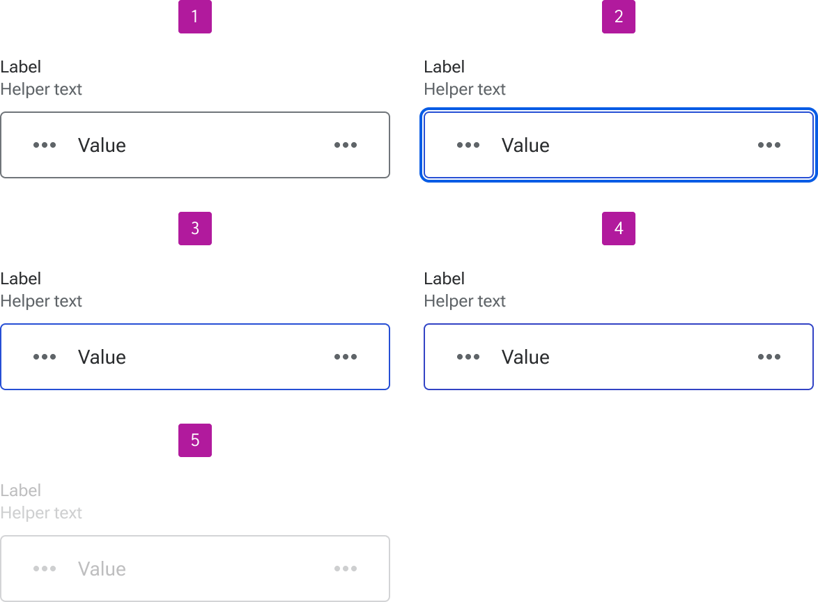
The input component is made up of 11 elements.
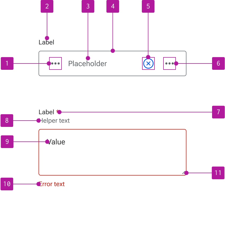
- Left slot
- Label
- Placeholder text
- Field
- Clear button
- Right slot
- Required indicator
- Helper text
- Value
- Error text
- Resizer
Variants
Type
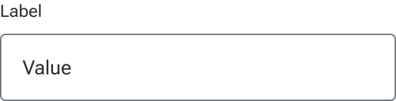
Text
The text input is the default type that allows a user to input a single line of text.
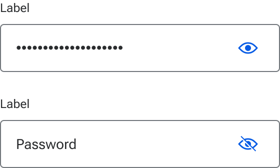
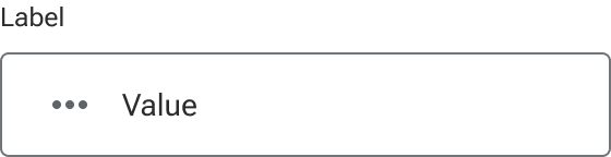
Password
Password inputs are based on the HTML password input type and used to obscure sensitive content within the input. The right icon slot is set to display an icon-only button with a show/hide icon by default, but can be customized. The right icon slot can also be hidden if that functionality is not needed. Passwords are masked by default.
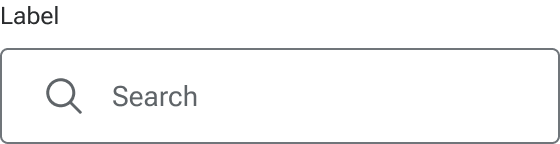
Search
Search inputs are based on the HTML search input type and used to provide semantic search capabilities. The left icon is set by default to a search icon for visual context and may be customized or hidden as needed.
Text area
The text area type allows the user to enter and edit multiple lines of text. Left and right icons are not available for text areas.
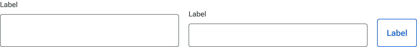
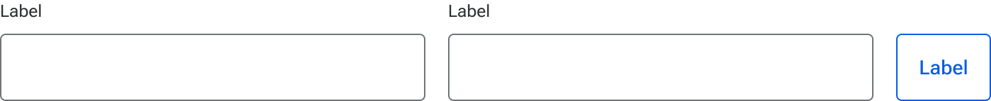
Size
The size of the input can be adjusted to accommodate a variety of space constraints. These sizes use fixed dimensions to guarantee that the height doesn’t grow based on the content of the input field. This ensures that all form elements of the same size compliment and predictably align with each other.
Input sizes are designed to compliment comparably-sized buttons. When placing inputs and buttons within the same form or grouping, be sure to use the same size for both to ensure consistent alignment. This is important even if the fields and buttons are stacked as they may rewrap to be inline at other breakpoints.
Small
Small inputs are used to reduce the overall height of the input field. They are recommended for forms with a high number of inputs or contexts that require more conservative spacing.
Medium
Medium inputs are designed to work in a variety of situations and are a good starting point for most layouts. They are the default size.

Large
Large inputs are recommended for forms with a relatively limited number of inputs or generous white space such as a username and password modal. They can also be used to improve touch triggering.
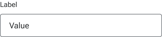
Label
Every input should have a label that describes the purpose of the input in a concise and clear manner. Built-in labels can be omitted if an adjacent label is included that adequately describes the purpose of the input and is correctly referenced to the field for accessibility purposes.
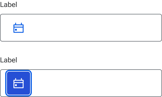
Left slot
A left slot is available for an icon to describe the type of input required, such as a date picker, or as a touch target to trigger nested components. The left slot is available on all input types except text area. When the slot is hidden, the input text expands to fill the available space.
When interactivity is required, a button should be used within the slot. This ensures the appropriate interactions are automatically enabled and affords a focus area for easy keyboard navigation. Consider using small, tertiary, icon-only buttons for consistency and to compliment the rest of the input elements.
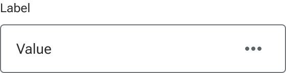
Right slot
The right slot can accommodate an icon to describe the type of input required, such as a date picker. It can also provide additional functionality such as clearing the content of a field or as a touch target when additional functionality is present. The right slot is available on all input types except text area. When the slot is hidden, the input text expands to fill the available space.
The right slot can also accommodate a button when a micro interaction is required within the input. Consider using small, tertiary, icon-only buttons for consistency and to compliment the rest of the input elements.
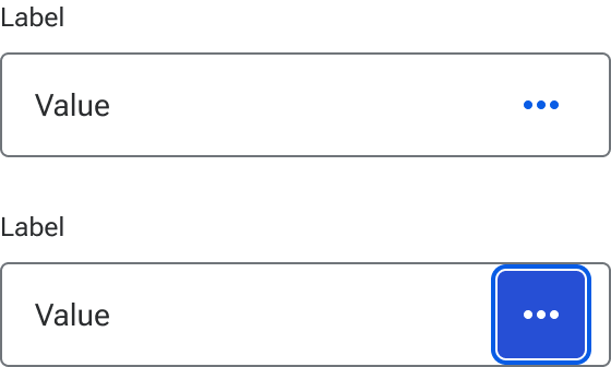
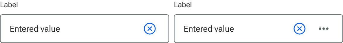
Clear button
A clear button can be enabled to allow users a way to quickly remove a value from the input field. When enabled, the button remains hidden until a value is entered into the input field and then persistently displays until the user clears the value. The clear button will not display when placeholder text is displayed. While the icon and button styling can be customized, the button itself is a persistent part of the input functionality and therefore cannot be customized.
The clear button always precedes the right icon slot.
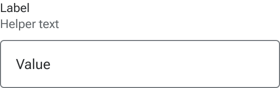
Helper text
Helper text is used to convey additional information about the input such as input requirements or character counts.
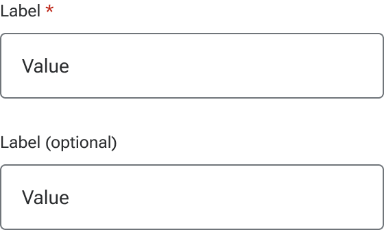
Required indicator
Inputs can be marked as either required or optional which triggers relevant validation on the form. The indicator is a preset and styled element within the component, not manually entered as part of the label string.
Required form elements are used when the majority of the form elements are optional, but a few need to be marked as required.
Optional form elements are used when the majority of the form elements are required, but a few elements need to be marked as optional.
Behavior
States
Inputs have five available base states:
- Enabled
- Focus
- Hover
- Active
- Disabled
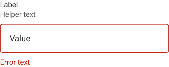
Invalid
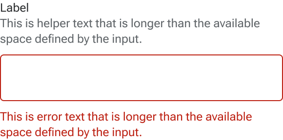
An invalid state can also be triggered on inputs to indicate that a value needs to be entered or that the entered value is invalid. Error text is always displayed as part of the invalid state to allow for a generic error message or provide specific guidance as to what needs to be fixed. Error text is always displayed in addition to any helper text that is present and below the input field.
Read-only
Inputs may be set to read-only for when form values need to be shown but shouldn’t be edited. Read-only content may still be copied by the user and hyperlinked content such as email addresses, URLs, and telephone numbers are still interactive. They are also part of the tab order and can receive focus.
The other configurable elements such as label, icons, and helper text can still be included and customized in a read-only input as needed.
On text areas, the resizer remains visible and functional.

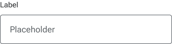
Placeholder
Placeholder text can be included to provide the user ancillary guidance on what should go into the input such as example text or a sample format for telephone numbers. Avoid displaying critical information within the placeholder as placeholder text disappears after the user begins entering data into the input. Placeholder text should not be used as a substitute for an input label.
Text overflow
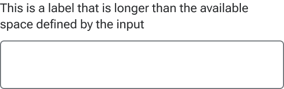
Label
Label text that is longer than the available space wraps to a new line.
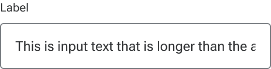
Value
Values that are longer than the input are handled using the behavior of native HTML inputs where the text is cropped by the interior boundaries of the input when it is not active. When the user activates the input, the full value becomes available and can be accessible via keyboard navigation or selection.
Helper and error text
Helper and error text wrap to a new line when they are too long for available horizontal space.
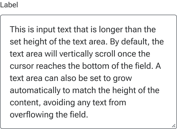
Text area height
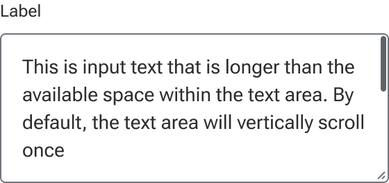
Scroll
By default, a text area will vertically scroll to accommodate text that overflows the text area’s boundaries. If the resizer is enabled, the dimensions of the text area can be resized by the user to allow more content to display. The scrollbar is the browser default and has no custom styling.
Auto grow
A text area can also be set to automatically grow to match the height of the content. A resizer can still be used with auto grow to momentarily override the dimensions of the text area. However, any change to the input text will cause the text area to “snap” back to the height of the content. When set to auto grow, a text area will not display a scrollbar even if the field is momentarily resized to crop the text.
Figma
Icon versus button
The left and right slots are primarily designed to accommodate icon and button components. Icons should be used in situations that are purely informative. For situations where interactivity is needed, an icon-only button should be used. When using a button, use element/jh-input-button which is included alongside jh-input. This is sized to appropriately fit within the input and represents how buttons will render in the input code.
Persisting slotted content
When switching input types, slotted icons and buttons may persist and override default content. For example, if you swap the envelope icon into the left slot of a text input, but then decide to change the text input to a search input, the envelope icon will override the default magnifying glass icon. To fix this, you can either drill down to the affected layer and reset it to the component defaults or ensure you’re starting with the correct input type.