Input
An input is a field that allows a user to enter and interact with text and numeric values.
Code documentation
When to use
An input is the default field for most form data, and the base that the typed inputs are built on.
- Collecting a short, single-line value the user types: a name, a nickname, an amount, a code.
- Editing an existing value in a detail or settings view.
- Any field where the answer is open-ended rather than chosen from a set.
When not to use
| Use instead | When |
|---|---|
| Textarea | The value runs to multiple lines: notes, descriptions, messages. |
| Select | The value comes from a known, finite set of options. |
| Radio group | The value comes from a small set and all options should stay visible. |
| Checkbox | The value is a boolean, or a set of independent toggles. |
| A typed input | The value has a known format with keyboard or validation implications. |
Typed inputs
These extend the base input with format-specific keyboards, validation, and affordances. Reach for them rather than configuring a base input by hand.
Anatomy
An input is assembled from three required parts and a set of optional ones.
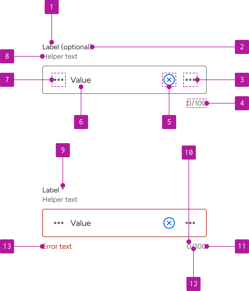
| # | Part | Required | Description |
|---|---|---|---|
| 1 | Label | Required | Names the field. Always visible. |
| 2 | Optional indicator | Optional | The word "optional" in parentheses, inline in the label. |
| 3 | Right slot | Optional | Icon or button after the value. |
| 4 | Character counter | Optional | Current length, divider, and maximum length. Sits below the field, right aligned. |
| 5 | Clear button | Optional | Removes the current value. |
| 6 | Suffix | Optional | Displays supplemental text after the value. |
| 7 | Value | Required | The text the user has entered. |
| 8 | Prefix | Optional | Displays supplemental text before the value. |
| 9 | Left slot | Optional | Icon or button before the value. |
| 10 | Helper text | Optional | Persistent supporting detail. Sits between the label and the field. |
| 11 | Required indicator | Optional | Asterisk following the label text. |
| 12 | Error text | Optional | Appears below the field when the value is invalid. |
Variants
Size
Size controls field height and the type scale inside it. All three use fixed heights, so a field never grows to fit its content. Medium is the default. Choose another only when surrounding density calls for it, and apply one size consistently across a form.
| Size | Use for |
|---|---|
| Small | Dense layouts: table rows, filter bars, inline editing |
| Medium | Standard forms and details views. The default. |
| Large | Touch-first surfaces: onboarding, account opening. |
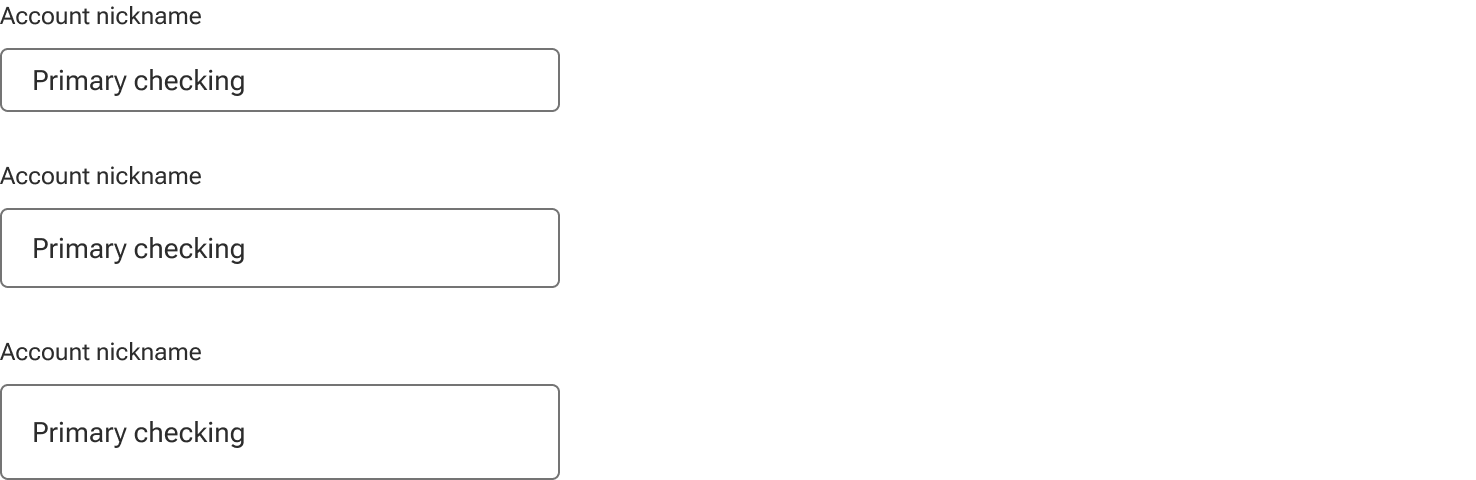
Inputs are designed to sit alongside buttons of the same size, so the two share a height and align on the same baseline.
Horizontal alignment
The value can be aligned to either the left or right edge of the input field. Use to help align numeric values.

Options
Label
Every input has a visible label naming the field in a concise, plain-language phrase. Labels may be visually hidden only where an adjacent element already names the field unambiguously, and even then the accessible name must remain. Label text that exceeds the available width wraps rather than truncating.
Required and optional indicators
Mark required fields when most fields in the form are optional. Mark optional fields when most are required. Pick one convention per form and hold it — marking both is redundant and makes neither read as meaningful.

Helper text
Helper text carries what the user needs before typing: expected format, where to find a value, what it will be used for. It's persistent, it doesn't appear only on focus or only on error, and it wraps when it exceeds the available width.

Prefix and suffix
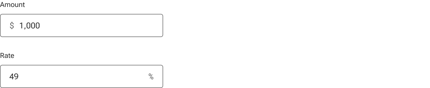
Supplemental content can be included before or after the value. Use the prefix and suffix properties to provide clarifying labels or identifiers for what the value represents such as currency types and units of measurement. The prefix and suffix properties only accept text strings. If icons or other non-text content is needed, use the left and right slots.
Left and right slots
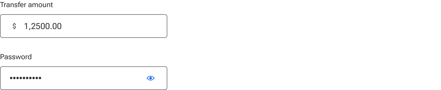
Both slots accept an icon or a button. Use an icon to describe the type of value expected: a currency symbol, a unit, a date marker. Use a button when the slot does something: reveal a password, open a picker, run a lookup. Slotted buttons are sized to the field automatically and receive the correct focus and keyboard behavior, don't size them by hand.
Clear button
Removes the current value in one action. It appears only when the field has a value and always sits immediately before the right slot. Use it on fields users are likely to empty and refill: search, filters, fields with a long default. Don't add it everywhere; on a short field, select-and-delete is no slower.

Character count
Show a counter when the field has a maximum length and the user could plausibly reach it: a memo line, a nickname, a subject.

Width
An input fills the width of its parent container by default.
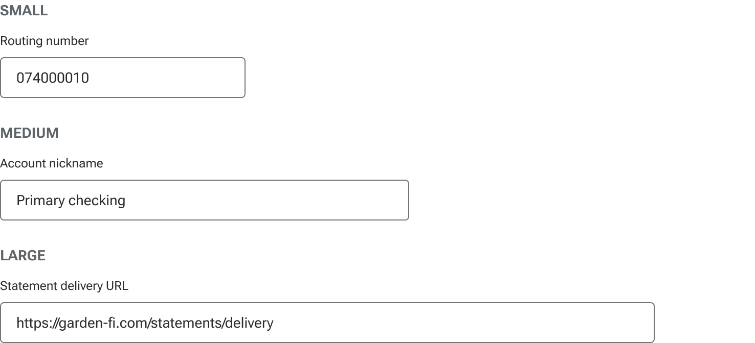
Width is an affordance, it signals how much content the field expects before the user types anything. A four-digit code in a 640px field reads as unfinished. A street address in a 240px field reads as too small. Size fields to the data they hold rather than letting every field span its column.
Width sizes
| Width | Maximum | Use for |
|---|---|---|
| Small | 240px | Short structured values: codes, amounts, ZIP, expiration, last four digits. |
| Medium | 400px | Single-line text: names, nicknames, email addresses, street address. |
| Large | 640px | Long values: URLs, descriptions, free text. |
These are maximums, not fixed widths. An input never exceeds its container, so a medium input in a 320px column renders at 320px. Always express width as max-width, never width, so the field can shrink.
Responsive behavior
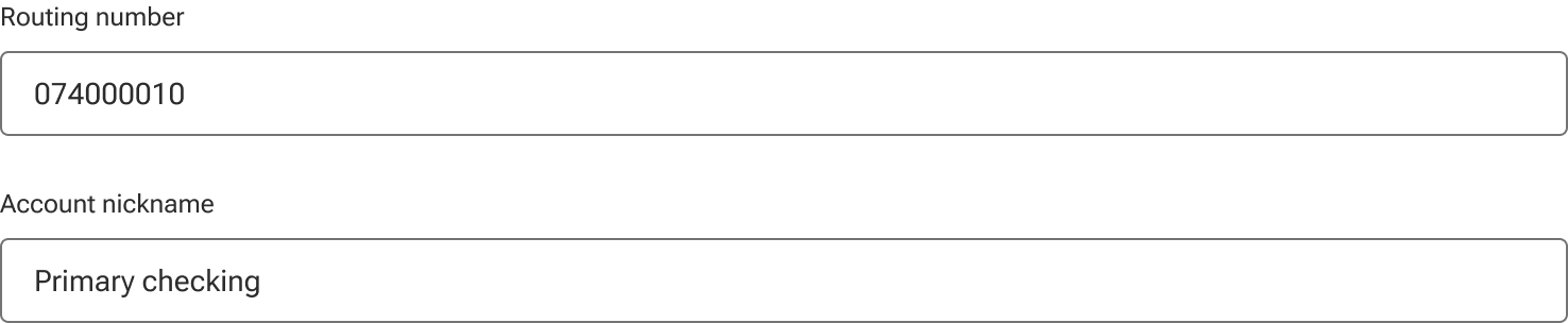
Width caps apply at the md breakpoint and above. Below md, every input fills 100% of its container regardless of the width assigned to it; on a narrow viewport a capped field leaves dead space without making anything easier to scan.
| Breakpoint | Behavior |
|---|---|
| sm and below | Full width of container, all sizes. |
| md and above | Capped at the assigned width. |
When a multi-column form reaches a narrow viewport, collapse the columns first and the widths second. Fields that go full width while still sitting in a two-column grid produce a ragged layout that reads worse than either rule on its own.
Applying width
Forge does not currently expose a width property. Apply max-width on the input, or on a layout container that wraps it, using the values above.
Because the --jh-dimension-* scale caps at 96px, it can't express input widths—the values here are documented pixel guidance rather than tokens.
Behavior
States
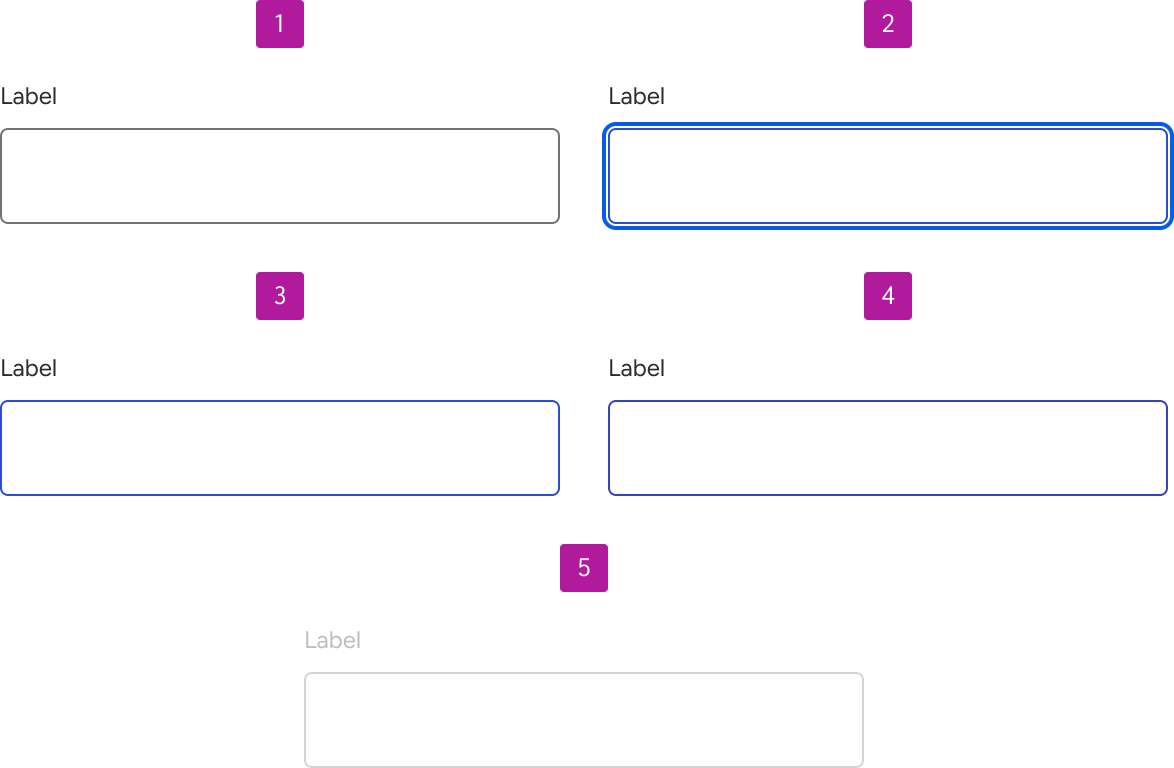
| State | When | Notes |
|---|---|---|
| Enabled | Default, ready for input | — |
| Hover | Pointer is over the field. | Pointer only. |
| Focus | Field has keyboard or pointer focus. | Focus ring stays visible. Never suppress it. |
| Disabled | Not available in this context. | Not focusable, not submitted. |
Invalid
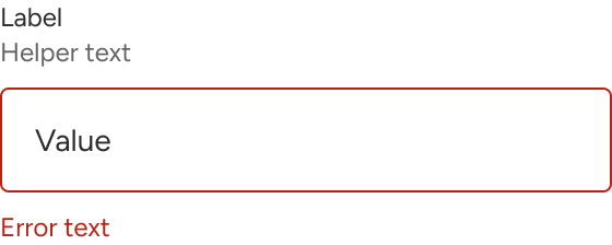
Error text can be displayed when an input is invalid to provide guidance as to what needs to be fixed. It's displayed below the input field in addition to any present helper text. Validate on blur rather than on each keystroke, then revalidate on change once a field has errored, so the error clears as soon as it's fixed.
Read-only
| Read-only | Disabled | |
|---|---|---|
| Focusable | Yes | No |
| Selectable and copyable | Pointer is over the field. | Pointer only. |
| Submitted with the form | Yes | No |
| Use for | Values the user should see but can’t change: account numbers, verified email, a rate set elsewhere. | Fields not currently available, usually pending another choice. |
Read-only is almost always right for a value the user needs to read, copy, or have announced. Disabled removes it from the keyboard path entirely.

Long values
Values longer than the visible field scroll within it rather than truncating or wrapping, matching native HTML behavior. Because the beginning of a long value scrolls out of view, don't rely on the field alone to confirm a value the user must verify. Show it back to them in a review step.
Content
How to write the words in and around the field. Nothing on the current page covers this, so label case, helper phrasing, and error wording are decided per team.
Labels
- Sentence case: Account nickname, not Account Nickname.
- Name the value, not the action—Email address, not Enter your email.
- Keep to a short noun phrase. Detail belongs in helper text.
- No trailing colon.
Helper text
- Say what the user needs before typing, not after.
- Give the format when it isn't obvious: Nine digits, no spaces.
- Don't restate the label.
Error messages
- Say what's wrong and how to fix it.
- Be specific. Invalid entry gives the user nothing to act on.
- Don't repeat the format: helper text stays visible above the field.
- Don't blame the user: Enter a valid email address, not You entered an invalid email address.
- No exclamation marks.
Accessibility
Forms are the highest-risk surface in an accessibility audit and inputs are the highest-risk part of a form. Most of the below is handled by the component; the rest is a consumer responsibility and is marked as such.
Labeling
Every input has a programmatically associated label, passing a label is sufficient. Never ship an input whose only name is a placeholder or an adjacent icon. Where a label must be hidden, the accessible name still has to be present, and the visible text must be contained within it, or speech-input users can't activate the field by saying what they see.
Descriptions
Helper and error text are associated via aria-describedby and announced after the label and role. Because both are visible at once in the error state, both need to be referenced, and the order matters. Error first, then helper, so the user hears what's wrong before hearing the format. Keep both short; everything in aria-describedby is read on every focus.
Required fields
The visual indicator is decorative and hidden from assistive technology. The requirement is carried by required on the field. An asterisk plus a legend is not an accessible required indicator on its own.
Errors
The field carries aria-invalid="true" when invalid, and error text uses an icon and text rather than color alone.
Placeholder text
Forge inputs don't support placeholder text. Placeholders disappear the moment the user types, so guidance vanishes when it's most needed; they're frequently mistaken for a filled value; they rarely meet contrast requirements; and screen reader support is inconsistent. Anything that would have gone in a placeholder belongs in the label or helper text, where it stays visible.
Clear button
- Has an accessible name: Clear, or Clear {field name} where several appear together.
- Sits in tab order between the field and the right slot.
- Meets the minimum target size on touch, including padding needed to reach it.
- Returns focus to the field after clearing.
Keyboard interaction
| Key | Behavior |
|---|---|
| Tab | Into the field, then the clear button, then the right slot, then out. |
| Shift + Tab | Reverses that order. |
| Enter | Submits the form, where the input sits in one. |
| Esc | Clears the field when a clear button is present. |
| Arrow keys | Move the caret within the value. |
Contrast
| Element | Requirement |
|---|---|
| Value and label text | 4.5:1 against background |
| Field border, enabled | 3:1 against background |
| Focus indicator | 3:1 against the adjacent color |
| Error text and icon | 4.5:1 against background |
| Disabled text | Exempt |
Figma
Icon versus button
Both slots accept icon and button components. Use icons for indication only; if the element does something, use the button component, which carries the correct target size, focus ring, and hover state. An icon styled to look like a button won't match the built version.
Persisting slotted content
Switching a variant's slotted content back to the parent default reverts it to the component's default content. Toggle a slot off and on and the affected layer resets. Detach or duplicate the layer rather than round-tripping the variant.