Checkbox
stableOverview
Checkbox is the control for a choice the user can turn on or off, alone or alongside other choices. A single checkbox can be required before a form submits, such as accepting terms. When that checkbox is invalid, error text says what to do next.
Usage
When to use
- Letting a user select any number of options, including none
- A single confirmation the form needs before it is submitted, such as accepting terms
- Marking one field optional when the rest of the form is required
When not to use
- Choosing one option from a mutually exclusive set — use Radio
- Turning a setting on or off immediately — use Switch
- Grouping several related checkboxes under one label — use Checkbox group
When a single checkbox is required
Require one checkbox when the user has to confirm it before the form is
submitted. Accepting terms is the usual case. Set required and
show-indicator together. The asterisk comes from the indicator, separate
from the label string.
Use the required asterisk when most fields are optional and this one has to be completed. Use the optional indicator when most fields are required and this one is not. Leave preference and marketing checkboxes optional.
How to write error text
Say what is wrong and the next step. For a terms checkbox, write "Agree to the terms to continue." A message that only says "Required" leaves the next step out.
Alternatives
Use when several related checkboxes share one label, indicator, and error.
Use when the user can select only one option in the set.
Use when the control takes effect immediately, with no separate submit.
Anatomy
The checkbox is made up of six elements.

- Checkbox input
The control the user selects.
- Helper text
Optional guidance under the label. Shown only when the label is set.
- Status mark
The check or indeterminate mark inside the control.
- Label
Names the checkbox. The first line stays vertically centered with the control when the label wraps.
- Indicator
"(optional)" or a required asterisk, placed after the label with a leading space. Shown when `show-indicator` is set.
- Error text
What is wrong, under the helper text. Shown when `invalid` is set. Wraps when the line is longer than the checkbox.
Variants
Label
Describes the purpose of the checkbox. The label can be omitted when an adjacent label describes the field and is referenced to it.
Helper text
Extra context for using the checkbox. Helper text is shown only when the label is set, and it wraps onto the next line.
Required
Indicates the checkbox has to be checked for the form to submit.
required is a boolean and defaults to false.
The indicator is part of the component. When required is true and
show-indicator is on, the label shows an asterisk. When required
is false and the indicator is on, the label shows "(optional)".

Pending code merge.
Invalid
Sets aria-invalid and shows the error text. invalid is a boolean
and defaults to false.
Use it when a required checkbox is still clear, or when the value was not accepted. Error text can name the next step or give a more specific explanation. It sits under the label and any helper text.
The checkbox does not raise its own alert. Add one when the message has to be announced as soon as it appears.
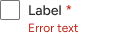
Pending code merge.
States
A checkbox can be unselected, selected, or indeterminate. Each of those has enabled, focus, hover, active, and disabled. Focus, hover, and active show up when you interact with the control.
Unselected
No selection.
Selected
Checked. Another interaction clears it.
Indeterminate
The next interaction selects the checkbox. The one after that clears it.
Disabled
Interaction is prevented. Some assistive technologies skip a disabled checkbox.
Configuration
import '@jack-henry/jh-elements/components/checkbox/checkbox.js'| Prop | Type | Default | Description |
|---|---|---|---|
checked | boolean | false | Sets the selected or 'checked' state on the checkbox. |
indeterminate | boolean | false | Sets the indeterminate state on the checkbox. |
disabled | boolean | false | Disables the checkbox and prevents all user interactions. May cause checkbox to be ignored by assistive technologies(AT). |
label | string | Sets the value of the data to be collected when selected. | |
helper-text | string | Provides additional context or guidance for using the checkbox. For helper-text to be displayed, the label property must also be set. | |
name | string | Sets the name of the checkbox data when submitted in a form. | |
value | string | Sets the value of the checkbox. | |
accessible-label | string | Sets an aria-label to assist screen reader users when no visible label is present. |
Events
| Event | Description |
|---|---|
jh-change | Dispatched when the state of the checkbox has changed. Event payload includes the value and checked state of the checkbox and can be accessed via e.detail.state.value and e.detail.state.checked. |
Pending code merge
These options are in the spec and are not in the package yet.
| Prop | Type | Default | Description |
|---|---|---|---|
show-indicator | boolean | false | Adds a visual indicator next to the label. It reads "(optional)" unless required is also set, which shows an asterisk. The label has to be set for the indicator to display. Figma property showIndicator. |
error-text | string | Text shown when invalid is true. Figma property errorText. |
Theming
Tune via style hook
| Hook | Description | Default |
|---|
Container radius (1)
| Hook | Description | Default |
|---|---|---|
--jh-checkbox-input-border-radius | The checkbox border radius. | --jh-border-radius-50 |
Focus ring (1)
| Hook | Description | Default |
|---|---|---|
--jh-checkbox-color-focus | The checkbox outline when it receives keyboard focus. | --jh-border-focus-color |
Disabled opacity (1)
| Hook | Description | Default |
|---|---|---|
--jh-checkbox-opacity-disabled | The checkbox opacity when disabled. | --jh-opacity-disabled |
4 Label text color (1)
| Hook | Description | Default |
|---|---|---|
--jh-checkbox-label-color-text | The label text color. | --jh-color-content-primary-enabled |
4 Text color (1)
| Hook | Description | Default |
|---|---|---|
--jh-checkbox-helper-color-text | The helper text color. | --jh-color-content-secondary-enabled |
Other (40)
| Hook | Description | Default |
|---|---|---|
--jh-checkbox-input-color-background-unselected-enabled | The checkbox background-color when unselected. | --jh-color-container-primary-enabled |
--jh-checkbox-input-color-border-unselected-enabled | The checkbox border-color when unselected. | --jh-border-control-color |
--jh-checkbox-input-color-background-unselected-focus | The checkbox background-color when unselected and focused. | --jh-color-container-primary-enabled |
--jh-checkbox-input-color-border-unselected-focus | The checkbox border-color when unselected and focused. | --jh-color-content-brand-hover |
--jh-checkbox-input-color-background-unselected-hover | The checkbox background-color when unselected and hovered. | --jh-color-container-primary-enabled |
--jh-checkbox-input-color-border-unselected-hover | The checkbox border-color when unselected and hovered. | --jh-color-content-brand-hover |
--jh-checkbox-input-color-background-unselected-active | The checkbox background-color when unselected and active. | --jh-color-container-primary-enabled |
--jh-checkbox-input-color-border-unselected-active | The checkbox border-color when unselected and active. | --jh-color-content-brand-active |
--jh-checkbox-input-color-background-unselected-disabled | The checkbox background-color when unselected and disabled. | --jh-color-container-primary-enabled |
--jh-checkbox-input-color-border-unselected-disabled | The checkbox border-color when unselected and disabled. | --jh-border-control-color |
--jh-checkbox-input-color-background-selected-enabled | The checkbox background-color when selected. | --jh-color-content-brand-enabled |
--jh-checkbox-input-color-border-selected-enabled | The checkbox border-color when selected. | --jh-color-content-brand-enabled |
--jh-checkbox-status-color-border-selected-enabled | The status mark color when selected. | --jh-color-content-on-brand-enabled |
--jh-checkbox-input-color-background-selected-focus | The checkbox background-color when selected and focused. | --jh-color-content-brand-hover |
--jh-checkbox-input-color-border-selected-focus | The checkbox border-color when selected and focused. | --jh-color-content-brand-hover |
--jh-checkbox-status-color-border-selected-focus | The status mark color when selected and focused. | --jh-color-content-on-brand-hover |
--jh-checkbox-input-color-background-selected-hover | The checkbox background-color when selected and hovered. | --jh-color-content-brand-hover |
--jh-checkbox-input-color-border-selected-hover | The checkbox border-color when selected and hovered. | --jh-color-content-brand-hover |
--jh-checkbox-status-color-border-selected-hover | The status mark color when selected and hovered. | --jh-color-content-on-brand-hover |
--jh-checkbox-input-color-background-selected-active | The checkbox background-color when selected and active. | --jh-color-content-brand-active |
--jh-checkbox-input-color-border-selected-active | The checkbox border-color when selected and active. | --jh-color-content-brand-active |
--jh-checkbox-status-color-border-selected-active | The status mark color when selected and active. | --jh-color-content-on-brand-active |
--jh-checkbox-input-color-background-selected-disabled | The checkbox background-color when selected and disabled. | --jh-color-content-brand-enabled |
--jh-checkbox-input-color-border-selected-disabled | The checkbox border-color when selected and disabled. | --jh-color-content-brand-enabled |
--jh-checkbox-status-color-border-selected-disabled | The status mark color when selected and disabled. | --jh-color-content-on-brand-enabled |
--jh-checkbox-input-color-background-indeterminate-enabled | The checkbox background-color when indeterminate. | --jh-color-content-brand-enabled |
--jh-checkbox-input-color-border-indeterminate-enabled | The border-color when indeterminate checkbox. | --jh-color-content-brand-enabled |
--jh-checkbox-status-color-border-indeterminate-enabled | The status mark color when indeterminate. | --jh-color-content-on-brand-enabled |
--jh-checkbox-input-color-background-indeterminate-focus | The checkbox background-color when indeterminate and focused. | --jh-color-content-brand-hover |
--jh-checkbox-input-color-border-indeterminate-focus | The checkbox border-color when indeterminate and focused. | --jh-color-content-brand-hover |
--jh-checkbox-status-color-border-indeterminate-focus | The checkbox color when indeterminate status mark when focused. | --jh-color-content-on-brand-hover |
--jh-checkbox-input-color-background-indeterminate-hover | The checkbox background-color when indeterminate and hovered. | --jh-color-content-brand-hover |
--jh-checkbox-input-color-border-indeterminate-hover | The checkbox border-color when indeterminate and hovered. | --jh-color-content-brand-hover |
--jh-checkbox-status-color-border-indeterminate-hover | The checkbox color when indeterminate status mark when hovered. | --jh-color-content-on-brand-hover |
--jh-checkbox-input-color-background-indeterminate-active | The checkbox background-color when indeterminate and active. | --jh-color-content-brand-active |
--jh-checkbox-input-color-border-indeterminate-active | The checkbox border-color when indeterminate and active. | --jh-color-content-brand-active |
--jh-checkbox-status-color-border-indeterminate-active | The checkbox color when indeterminate status mark when active. | --jh-color-content-on-brand-active |
--jh-checkbox-input-color-background-indeterminate-disabled | The checkbox background-color when indeterminate and disabled. | --jh-color-content-brand-enabled |
--jh-checkbox-input-color-border-indeterminate-disabled | The checkbox border-color when indeterminate and disabled. | --jh-color-content-brand-enabled |
--jh-checkbox-status-color-border-indeterminate-disabled | The checkbox color when indeterminate status mark when disabled. | --jh-color-content-on-brand-enabled |
Fixed
- Checkbox input — not customizable
- Helper text — not customizable
- Status mark — not customizable
- Indicator — not customizable
- Error text — not customizable
Examples
Required
A terms checkbox has to be checked before the form is submitted. The asterisk comes from the indicator.
<jh-checkbox label="I agree to the terms" show-indicator required></jh-checkbox>Invalid, with error text
The error names the next step. The image is the spec placeholder, with the sample string "Error text".
<jh-checkbox
  label="I agree to the terms"
  show-indicator
  required
  invalid
  error-text="Agree to the terms to continue."
></jh-checkbox>
Accessibility
The label is the accessible name. When there is no visible label, set
accessible-label.
invalid sets aria-invalid and shows the error text beside the
control. That text is not announced on its own. Add an alert when the
message has to be heard as soon as it appears.
A disabled checkbox may be skipped by assistive technologies.