Button
stableButtons enable a user to initiate a specific action.
Overview
Button is the primary control for initiating an action. It signals what will happen on click and carries the weight of the decision the user is making — primary buttons commit, secondary buttons offer escape, danger buttons commit destructively. The component's emphasis hierarchy is load-bearing: how prominent a button looks should match how consequential its action is.
Usage
When to use
- Committing a change a user has explicitly chosen — "Save", "Continue", "Delete"
- Triggering a flow or transaction whose effect happens outside the current view
- Acting as the single, unambiguous call to action in a card, dialog, or form
One primary per view. Neutral for everything else. Secondary only beside a primary. Tertiary where a border would be noise.
When not to use
- Navigating between pages or sections — use a Link instead, even if the link is styled as a button
- Toggling a binary state — use a Switch or Checkbox for on/off, not a button
- Selecting from a set of mutually exclusive options — use Radio or Segmented control
Keep the label concise and action-driven. A left icon reinforces the action, and a right icon shows what happens next. Use an icon alone only in a compact layout, and give it a tooltip and an accessible name.
Alternatives
Use when the action is navigation (<a href>), not a page-local action.
Use for icon-only actions in compact layouts. IconButton enforces the accessible-name requirement automatically.
Use when the control toggles a setting on or off.
Anatomy
The button is made up of five elements.
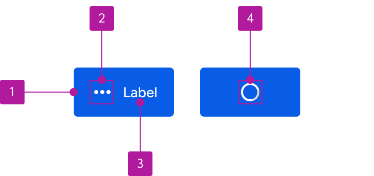
- Container
The interactive surface that holds the button content.
- Leading icon
Optional glyph before the label.
- Label
The text that describes the action.
- Trailing icon
Optional glyph after the label.
- Progress
Replaces the label and icon while the button is in a pending state.
Variants
Button has five appearances mapped to a single dimension — emphasis. Choose by how prominent the action should be in its context, not by color preference. The code default is secondary for compatibility; set appearance deliberately.
Neutral
The everyday button. Use it for most actions in a view: toolbar actions, secondary tasks, anything that isn't the one thing we want the user to do. Gray outline, dark label, so it sits quietly next to content.
Primary
The one action we want the user to take. One per view. If two actions feel primary, one of them isn't.
Secondary
The paired action beside a primary, usually Cancel or Back. Brand outline so it reads as part of the same decision as the primary. Don't use it on its own; a lone secondary wants to be neutral.
Tertiary
Lowest emphasis, no outline. Use it for inline or repeated actions where even a neutral border would add noise: table rows, list items, dense toolbars.
Danger
Destructive actions only. Delete, Remove, Discard. Never for emphasis.
Sizes
Buttons come in four sizes: x-small, small, medium, and large. Match a size to an input of the same size in a form.
- X-small — nested inside a smaller component. There is no matching input, so don't use x-small in a form
- Small — limited vertical space or pairing with similarly-sized content
- Medium (default) — most button instances
- Large — limited cases where the button needs extra prominence; typically one per view
Block
A block button expands to its container's width. Use when stacking calls to action in a card or dialog.
States
Every appearance implements all six states.
Enabled
Default resting state.
Hover
Hover to see it
Focus
Tab to it
Active
Press and hold.
Disabled
Interaction prevented.
Pending
Label and icon are replaced by a progress indicator. Use while a process such as saving is in progress.
Configuration
import '@jack-henry/jh-elements/components/button/button.js'| Prop | Type | Default | Description |
|---|---|---|---|
accessible-disabled | 'true' | 'false' | Sets an aria-disabled to signify to screen readers that the disabled button should remain perceivable while disabled. | |
accessible-label | string | Sets an aria-label to assist screen reader users when no visible label is present. | |
appearance | 'primary' | 'secondary' | 'tertiary' | 'danger' | secondary | Determines the button color. |
block | boolean | false | Sets the button width to its parent container. |
disabled | boolean | false | Disables the button and prevents all user interactions. May cause button to be ignored by assistive technologies(AT). See accessible-disabled attribute if the button should remain perceivable to AT. |
href | string | Sets the link's destination. | |
pending | boolean | false | Displays a progress indicator. |
label | string | Describes the intent of the button. | |
name | string | Sets the name of the button data when submitted in a form. | |
size | 'x-small' | 'small' | 'medium' | 'large' | medium | Sets the size of the button. |
submit | boolean | false | Sets button type='submit'. Button defaults to type='button'. |
target | '_blank' | '_self' | '_parent' | '_top' | Specifies where to display the linked URL set by the href property. | |
value | string | Sets the value of the button. |
Slots
| Slot | Description |
|---|---|
jh-button-icon-left | Use to insert an icon on the left side of the button and for single icon buttons. |
jh-button-icon-right | Use to insert an icon on the right side of the button and for single icon buttons. |
Theming
Tune via style hook
| Hook | Description | Default |
|---|
1 Container background (24)
| Hook | Description | Default |
|---|---|---|
--jh-button-color-background-primary-enabled | The button container background-color when enabled and appearance="primary". | --jh-color-content-brand-enabled |
--jh-button-color-background-primary-focus | The button container background-color when in focus and appearance="primary". | --jh-color-content-brand-hover |
--jh-button-color-background-primary-hover | The button container background-color when hovered and appearance="primary". | --jh-color-content-brand-hover |
--jh-button-color-background-primary-active | The button container background-color when active and appearance="primary". | --jh-color-content-brand-active |
--jh-button-color-background-primary-disabled | The button container background-color when disabled and appearance="primary". | --jh-color-content-brand-enabled |
--jh-button-color-background-primary-pending | The button container background-color when pending and appearance="primary". | --jh-color-content-brand-enabled |
--jh-button-color-background-secondary-enabled | The button container background-color when enabled and appearance="secondary". | transparent |
--jh-button-color-background-secondary-focus | The button container background-color when in focus and appearance="secondary". | --jh-color-content-brand-hover |
--jh-button-color-background-secondary-hover | The button container background-color when hovered and appearance="secondary". | --jh-color-content-brand-hover |
--jh-button-color-background-secondary-active | The button container background-color when active and appearance="secondary". | --jh-color-content-brand-active |
--jh-button-color-background-secondary-disabled | The button container background-color when disabled and appearance="secondary". | transparent |
--jh-button-color-background-secondary-pending | The button container background-color when pending and appearance="secondary". | transparent |
--jh-button-color-background-tertiary-enabled | The button container background-color when enabled and appearance="tertiary". | transparent |
--jh-button-color-background-tertiary-focus | The button container background-color when in focus and appearance="tertiary". | --jh-color-content-brand-hover |
--jh-button-color-background-tertiary-hover | The button container background-color when hovered and appearance="tertiary". | --jh-color-content-brand-hover |
--jh-button-color-background-tertiary-active | The button container background-color when active and appearance="tertiary". | --jh-color-content-brand-active |
--jh-button-color-background-tertiary-disabled | The button container background-color when disabled and appearance="tertiary". | transparent |
--jh-button-color-background-tertiary-pending | The button container background-color when pending and appearance="tertiary". | transparent |
--jh-button-color-background-danger-enabled | The button container background-color when enabled and appearance="danger". | --jh-color-content-negative-enabled |
--jh-button-color-background-danger-focus | The button container background-color when in focus and appearance="danger". | --jh-color-content-negative-hover |
--jh-button-color-background-danger-hover | The button container background-color when hovered and appearance="danger". | --jh-color-content-negative-hover |
--jh-button-color-background-danger-active | The button container background-color when active and appearance="danger". | --jh-color-content-negative-active |
--jh-button-color-background-danger-disabled | The button container background-color when disabled and appearance="danger". | --jh-color-content-negative-enabled |
--jh-button-color-background-danger-pending | The button container background-color when pending and appearance="danger". | --jh-color-content-negative-enabled |
1 Container border (24)
| Hook | Description | Default |
|---|---|---|
--jh-button-color-border-primary-enabled | The button container border-color when enabled and appearance="primary". | transparent |
--jh-button-color-border-primary-focus | The button container border-color when in focus and appearance="primary". | transparent |
--jh-button-color-border-primary-hover | The button container border-color when hovered and appearance="primary". | transparent |
--jh-button-color-border-primary-active | The button container border-color when active and appearance="primary". | transparent |
--jh-button-color-border-primary-disabled | The button container border-color when disabled and appearance="primary". | transparent |
--jh-button-color-border-primary-pending | The button container border-color when pending and appearance="primary". | transparent |
--jh-button-color-border-secondary-enabled | The button container border-color when enabled and appearance="secondary". | --jh-border-action-color |
--jh-button-color-border-secondary-focus | The button container border-color when in focus and appearance="secondary". | --jh-color-content-brand-hover |
--jh-button-color-border-secondary-hover | The button container border-color when hovered and appearance="secondary". | --jh-color-content-brand-hover |
--jh-button-color-border-secondary-active | The button container border-color when active and appearance="secondary". | --jh-color-content-brand-active |
--jh-button-color-border-secondary-disabled | The button container border-color when disabled and appearance="secondary". | --jh-border-action-color |
--jh-button-color-border-secondary-pending | The button container border-color when pending and appearance="secondary". | --jh-border-action-color |
--jh-button-color-border-tertiary-enabled | The button container border-color when enabled and appearance="tertiary". | transparent |
--jh-button-color-border-tertiary-focus | The button container border-color when in focus and appearance="tertiary". | transparent |
--jh-button-color-border-tertiary-hover | The button container border-color when hovered and appearance="tertiary". | transparent |
--jh-button-color-border-tertiary-active | The button container border-color when active and appearance="tertiary". | transparent |
--jh-button-color-border-tertiary-disabled | The button container border-color when disabled and appearance="tertiary". | transparent |
--jh-button-color-border-tertiary-pending | The button container border-color when pending and appearance="tertiary". | transparent |
--jh-button-color-border-danger-enabled | The button container border-color when enabled and appearance="danger". | transparent |
--jh-button-color-border-danger-focus | The button container border-color when in focus and appearance="danger". | transparent |
--jh-button-color-border-danger-hover | The button container border-color when hovered and appearance="danger". | transparent |
--jh-button-color-border-danger-active | The button container border-color when active and appearance="danger". | transparent |
--jh-button-color-border-danger-disabled | The button container border-color when disabled and appearance="danger". | transparent |
--jh-button-color-border-danger-pending | The button container border-color when pending and appearance="danger". | transparent |
1 Container radius (1)
| Hook | Description | Default |
|---|---|---|
--jh-button-border-radius | The button container border-radius. | --jh-border-radius-100 |
1 Focus ring (1)
| Hook | Description | Default |
|---|---|---|
--jh-button-color-focus | The button container outline when it receives keyboard focus. | --jh-border-focus-color |
1 Disabled opacity (1)
| Hook | Description | Default |
|---|---|---|
--jh-button-opacity-disabled | The button container opacity when disabled. | --jh-opacity-disabled |
3 Label text color (20)
| Hook | Description | Default |
|---|---|---|
--jh-button-label-color-text-primary-enabled | The label text color when enabled and appearance="primary". | --jh-color-content-on-brand-enabled |
--jh-button-label-color-text-primary-focus | The label text color when in focus and appearance="primary". | --jh-color-content-on-brand-hover |
--jh-button-label-color-text-primary-hover | The label text color when hovered and appearance="primary". | --jh-color-content-on-brand-hover |
--jh-button-label-color-text-primary-active | The label text color when active and appearance="primary". | --jh-color-content-on-brand-active |
--jh-button-label-color-text-primary-disabled | The label text color when disabled and appearance="primary". | --jh-color-content-on-brand-enabled |
--jh-button-label-color-text-secondary-enabled | The label text color when enabled and appearance="secondary". | --jh-color-content-brand-enabled |
--jh-button-label-color-text-secondary-focus | The label text color when in focus and appearance="secondary". | --jh-color-content-on-brand-hover |
--jh-button-label-color-text-secondary-hover | The label text color when hovered and appearance="secondary". | --jh-color-content-on-brand-hover |
--jh-button-label-color-text-secondary-active | The label text color when active and appearance="secondary". | --jh-color-content-on-brand-active |
--jh-button-label-color-text-secondary-disabled | The label text color when disabled and appearance="secondary". | --jh-color-content-brand-enabled |
--jh-button-label-color-text-tertiary-enabled | The label text color when enabled and appearance="tertiary". | --jh-color-content-brand-enabled |
--jh-button-label-color-text-tertiary-focus | The label text color when in focus and appearance="tertiary". | --jh-color-content-on-brand-hover |
--jh-button-label-color-text-tertiary-hover | The label text color when hovered and appearance="tertiary". | --jh-color-content-on-brand-hover |
--jh-button-label-color-text-tertiary-active | The label text color when active and appearance="tertiary". | --jh-color-content-on-brand-active |
--jh-button-label-color-text-tertiary-disabled | The label text color when disabled and appearance="tertiary". | --jh-color-content-brand-enabled |
--jh-button-label-color-text-danger-enabled | The label text color when enabled and appearance="danger". | --jh-color-content-on-negative-enabled |
--jh-button-label-color-text-danger-focus | The label text color when in focus and appearance="danger". | --jh-color-content-on-negative-hover |
--jh-button-label-color-text-danger-hover | The label text color when hovered and appearance="danger". | --jh-color-content-on-negative-hover |
--jh-button-label-color-text-danger-active | The label text color when active and appearance="danger". | --jh-color-content-on-negative-active |
--jh-button-label-color-text-danger-disabled | The label text color when disabled and appearance="danger". | --jh-color-content-on-negative-enabled |
2, 4 Icon fill (20)
| Hook | Description | Default |
|---|---|---|
--jh-button-icon-color-fill-primary-enabled | The icon color when enabled and appearance="primary". | --jh-color-content-on-brand-enabled |
--jh-button-icon-color-fill-primary-focus | The icon color when in focus and appearance="primary". | --jh-color-content-on-brand-hover |
--jh-button-icon-color-fill-primary-hover | The icon color when hovered and appearance="primary". | --jh-color-content-on-brand-hover |
--jh-button-icon-color-fill-primary-active | The icon color when active and appearance="primary". | --jh-color-content-on-brand-active |
--jh-button-icon-color-fill-primary-disabled | The icon color when disabled and appearance="primary". | --jh-color-content-on-brand-enabled |
--jh-button-icon-color-fill-secondary-enabled | The icon color when enabled and appearance="secondary". | --jh-color-content-brand-enabled |
--jh-button-icon-color-fill-secondary-focus | The icon color when in focus and appearance="secondary". | --jh-color-content-on-brand-hover |
--jh-button-icon-color-fill-secondary-hover | The icon color when hovered and appearance="secondary". | --jh-color-content-on-brand-hover |
--jh-button-icon-color-fill-secondary-active | The icon color when active and appearance="secondary". | --jh-color-content-on-brand-active |
--jh-button-icon-color-fill-secondary-disabled | The icon color when disabled and appearance="secondary". | --jh-color-content-brand-enabled |
--jh-button-icon-color-fill-tertiary-enabled | The icon color when enabled and appearance="tertiary". | --jh-color-content-brand-enabled |
--jh-button-icon-color-fill-tertiary-focus | The icon color when in focus and appearance="tertiary". | --jh-color-content-on-brand-hover |
--jh-button-icon-color-fill-tertiary-hover | The icon color when hovered and appearance="tertiary". | --jh-color-content-on-brand-hover |
--jh-button-icon-color-fill-tertiary-active | The icon color when active and appearance="tertiary". | --jh-color-content-on-brand-active |
--jh-button-icon-color-fill-tertiary-disabled | The icon color when disabled and appearance="tertiary". | --jh-color-content-brand-enabled |
--jh-button-icon-color-fill-danger-enabled | The icon color when enabled and appearance="danger". | --jh-color-content-on-negative-enabled |
--jh-button-icon-color-fill-danger-focus | The icon color when in focus and appearance="danger". | --jh-color-content-on-negative-hover |
--jh-button-icon-color-fill-danger-hover | The icon color when hovered and appearance="danger". | --jh-color-content-on-negative-hover |
--jh-button-icon-color-fill-danger-active | The icon color when active and appearance="danger". | --jh-color-content-on-negative-active |
--jh-button-icon-color-fill-danger-disabled | The icon color when disabled and appearance="danger". | --jh-color-content-on-negative-enabled |
5 Progress track (4)
| Hook | Description | Default |
|---|---|---|
--jh-button-progress-track-color-border-primary-pending | The progress indicator track-color when appearance="primary". | --jh-color-control-enabled |
--jh-button-progress-track-color-border-secondary-pending | The progress indicator track-color when appearance="secondary". | --jh-color-control-enabled |
--jh-button-progress-track-color-border-tertiary-pending | The progress indicator track-color when appearance="tertiary". | --jh-color-control-enabled |
--jh-button-progress-track-color-border-danger-pending | The progress indicator track-color when appearance="danger". | --jh-color-control-enabled |
5 Progress indicator (4)
| Hook | Description | Default |
|---|---|---|
--jh-button-progress-color-border-primary-pending | The progress indicator border-color when appearance="primary". | --jh-color-content-on-brand-enabled |
--jh-button-progress-color-border-secondary-pending | The progress indicator border-color when appearance="secondary". | --jh-color-content-brand-enabled |
--jh-button-progress-color-border-tertiary-pending | The progress indicator border-color when appearance="tertiary". | --jh-color-content-brand-enabled |
--jh-button-progress-color-border-danger-pending | The progress indicator border-color when appearance="danger". | --jh-color-content-on-negative-enabled |
1 Size token (1)
| Hook | Description | Default |
|---|---|---|
--jh-button-size | The button width of single icon buttons, and the button height. Button width and height defaults to --jh-dimension-600 when size="x-small",--jh-dimension-800 when size="small", --jh-dimension-1000 when size="medium", and --jh-dimension-1200 when size="large". | --jh-dimension-600, --jh-dimension-800, --jh-dimension-1000, --jh-dimension-1200 |
Change via mechanism
appearancesizesets--jh-button-sizeblock
Examples
Toolbar actions
Standalone actions use neutral.
<jh-button label="Export" appearance="neutral"></jh-button>
<jh-button label="Filter" appearance="neutral"></jh-button>
Primary action with cancel pairing
The cancel is a secondary because it's paired with a primary.
<jh-button label="Save changes" appearance="primary"></jh-button>
<jh-button label="Cancel"></jh-button>
Destructive action
Make the destructive nature explicit in the label — don't rely on color alone.
<jh-button label="Delete account" appearance="danger"></jh-button>Button with leading icon
Use an icon to reinforce the action. Place icons before the label by default.
<jh-button label="Add item" appearance="primary">
  <jh-icon slot="jh-button-icon-left">
    <svg viewBox="0 0 24 24"><path d="M11 5h2v14h-2zM5 11h14v2H5z"></path></svg>
  </jh-icon>
</jh-button>
Block button in a dialog
Stack block buttons when they're the only call to action in a constrained container.
<jh-button label="Continue" appearance="primary" block></jh-button>Accessibility
WCAG conformance
Button targets WCAG 2.2 AA. The default tokens satisfy 1.4.3 (Contrast Minimum) and 1.4.11 (Non-text Contrast) on Forge's default surface; custom token overrides are the consumer's responsibility to validate. Minimum touch target is 44×44 CSS pixels (2.5.5).
Keyboard
Buttons are reachable via Tab, activated via Enter or Space. They
should not be removed from the tab order unless disabled.
Screen reader
The label is the accessible name. For icon-only buttons, provide an
aria-label (Web) — the icon alone is not a sufficient accessible name.