Select
Selects are interactive controls that display a list of selectable options.
Code documentation
Anatomy
The select component is made up of 10 elements.
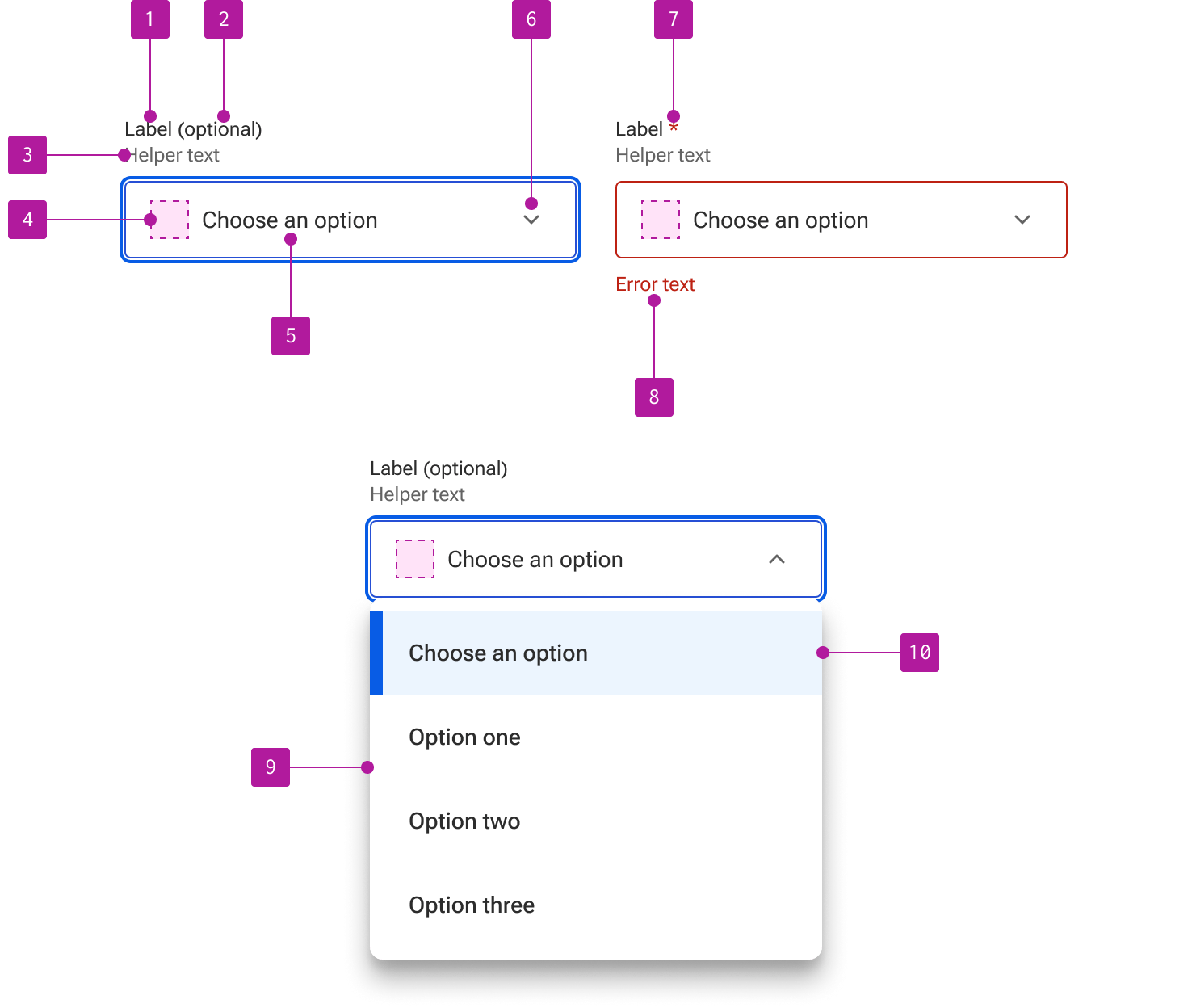
- Label
- Optional indicator
- Helper text
- Left slot
- Value
- Right icon
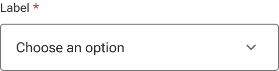
- Required indicator
- Error text
- Menu
- List item
Variants
Size
The size of the select can be adjusted to accommodate a variety of space constraints. These sizes use fixed dimensions to guarantee that the height doesn’t grow based on the content of the select’s input field. This ensures that all form elements of the same size compliment and predictably align with each other.
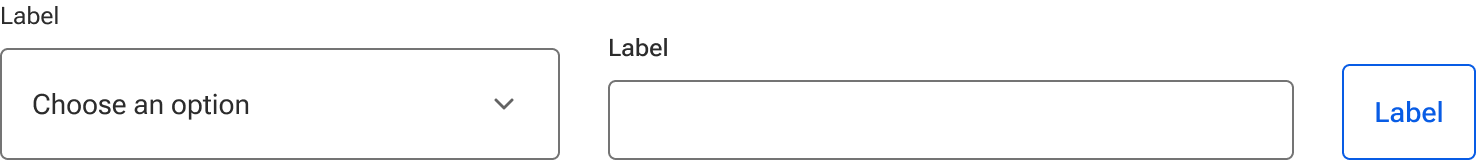
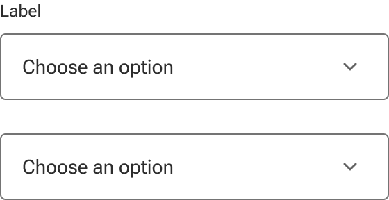
Select sizes are designed to compliment comparably-sized buttons and inputs. When placing any of these components within the same form or grouping, be sure to use the same size for each to ensure consistent alignment. This is important even if they are stacked as they may rewrap to be inline at other breakpoints.

When choosing sizes, consider the overall density of form elements and available space. If you have a form with many form elements and/or limited space, consider using small selects. Forms with fewer elements and/or more white space can better leverage larger selects. Medium-sized selects are designed to work in a variety of situations and are a good starting point for most layouts.
Small
Small selects are used to reduce the overall height of the input field. They are recommended for forms with a high number of form fields or contexts that require more conservative vertical spacing.
Medium
Medium selects are a good general use size designed for a variety of layouts and are the default size.
Large
Large selects are recommended for forms with a relatively limited number of form fields or to improve touch triggering.
Label
Every select should have a label that describes the purpose of the select in a concise and clear manner. Built-in labels can be omitted if an adjacent label is included that adequately describes the purpose of the select and is correctly referenced to the field for accessibility purposes.
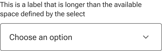
Label text that is longer than the available space wraps to a new line.
Indicator
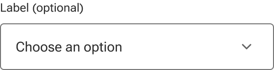
Selects can be marked as either required or optional which triggers relevant validation on the form. The indicator is a preset and styled element within the component, not manually entered as part of the label string.
Required form elements are used when the majority of the form elements are optional, but a few need to be marked as required.
Optional form elements are used when the majority of the form elements are required, but a few elements need to be marked as optional.
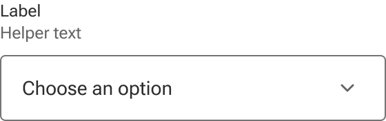
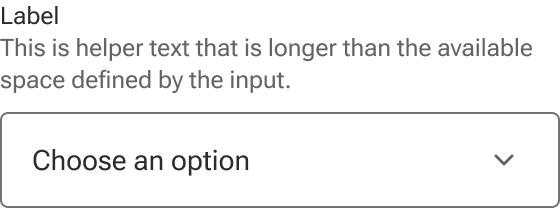
Helper text
Helper text is used to convey additional information about the select such as format requirements.
Helper text wraps to a new line when it’s too long for the available horizontal space.
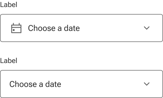
Left slot
A left slot is available for an icon to describe the type of select required. When the slot is hidden, the select text expands to fill the available space.
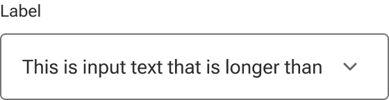
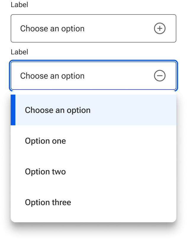
Value
Values that are longer than the select’s input field are cropped by the interior boundaries of the field when it is not active. When the user opens the select, the full value is visible within the menu and can be accessible via keyboard navigation.
The first option in the menu is what will display by default as the value.
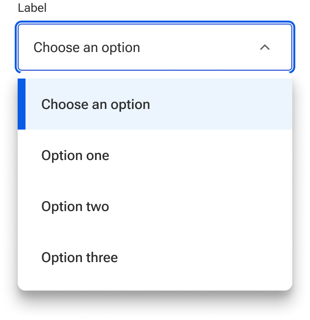
Expand/collapse icon
A custom icon can be slotted in to override the default expand/collapse icon if required. Be careful to use icons that reliably convey the concepts of expanding and collapsing.
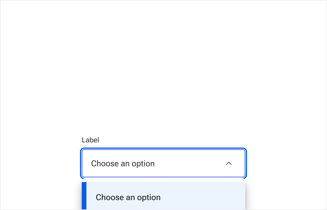
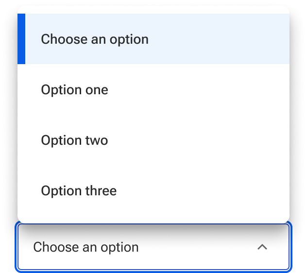
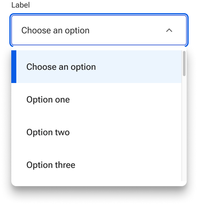
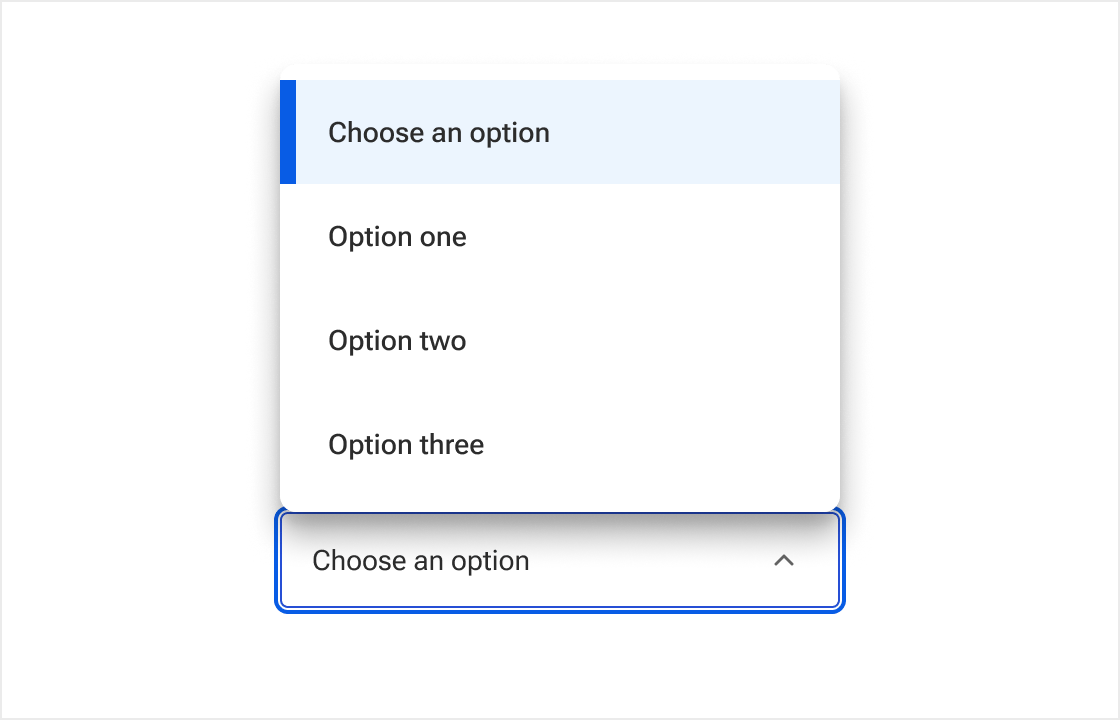
Menu
By default, the menu is anchored to the bottom edge of the input field and expands away from the edge. When open, the menu overlays any content that occurs after the select in the content flow.
The menu position can be set to be anchored to the top edge of the input field. In this case, the menu overlays content that precedes the select in the content flow. The positioning can be used alone or in conjunction with the flipping behavior to ensure the menu always expands as fully as possible.
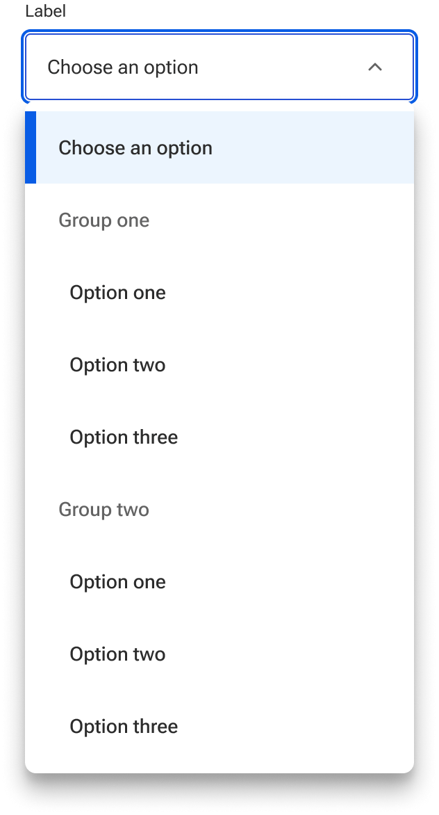
Menu options
The select’s menu options are list items constructed by passing in a data object. All of the list item states are available for use and customization.

The menu can also receive data configured for groups of items. This generates a series of list group components with nested list items. The list group header can be configured as part of the data object to help contextualize groupings of options. The list group header is not a selectable option within the menu and will not display as a value. Grouped items are indented to create better distinction between the groupings. Many of the list group style properties—including indentation—may be customized using the provided style hooks.
Width constraints
By default, the menu width matches the input field width. However, a max-width can be set via style hook so that the menu grows only so wide regardless the width of the input field. This applies to both the top and bottom menu positions.
A user can also set a min-width via style hook so that the menu shrinks only so narrow regardless the width of the input field. The min-width applies to both top and bottom menu positions.
Height constraints
A user can leverage a style hook to override the default max-height for the select menu. Once the menu reaches the max-height, it stops growing and displays a scrollbar to access the options that overflow the boundaries of the menu. The menu will continue to hug the items if the total height of the items is less than the max height.
There are situations where the max-height may cause the menu to extend beyond the viewport making it difficult to visualize the selected items. In these cases, the user should either select a smaller max-height value or ensure the menu can flip to the opposite side.
Behavior
States
Selects have five available base states:
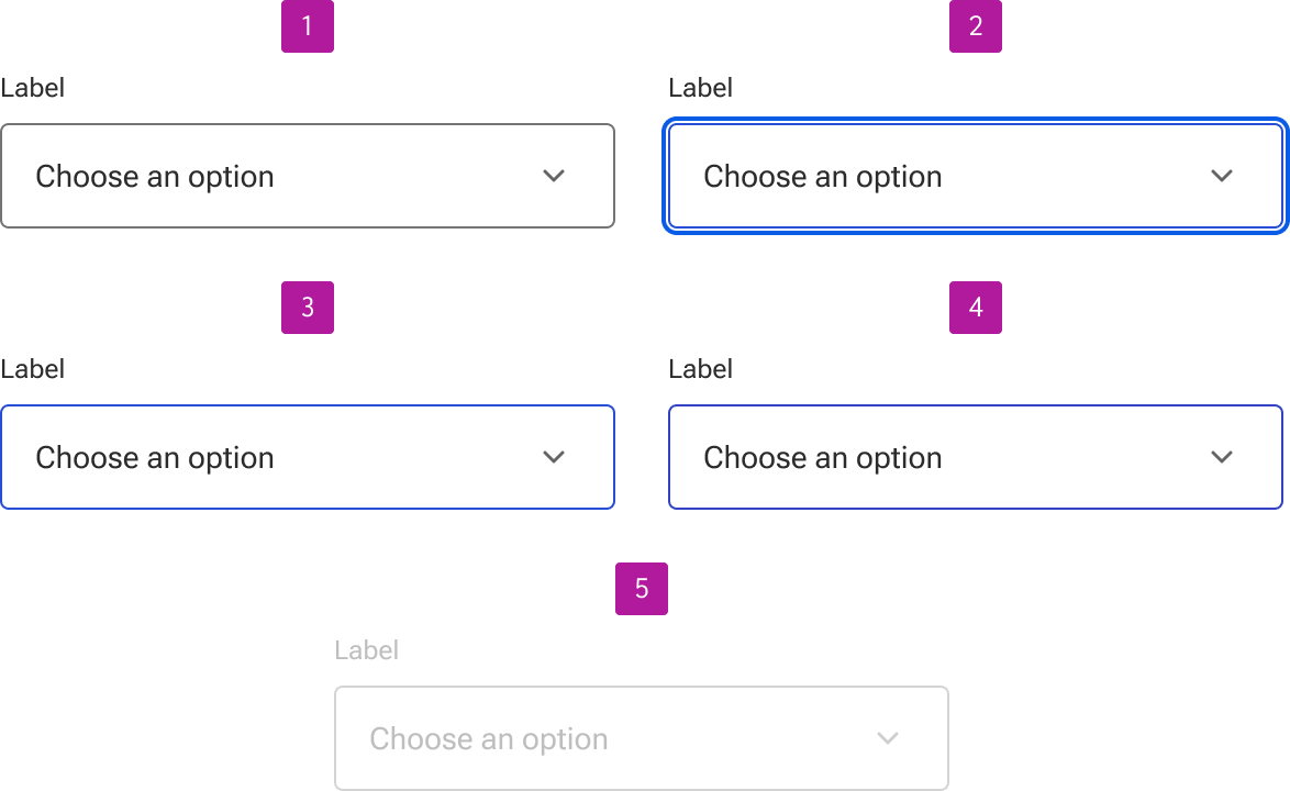
- Enabled
- Focus
- Hover
- Active
- Disabled
Invalid
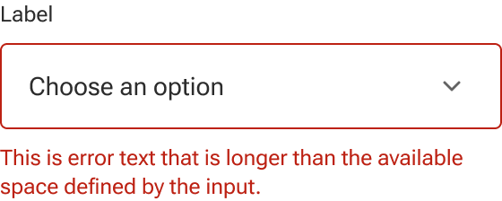
Selects can be set to invalid to indicate that a value needs to be selected or that the selected value is invalid. Error text is always displayed as part of the invalid state to allow for a generic error message or provide specific guidance as to what needs to be fixed. It is also displayed in addition to any helper text that is present and below the input field.
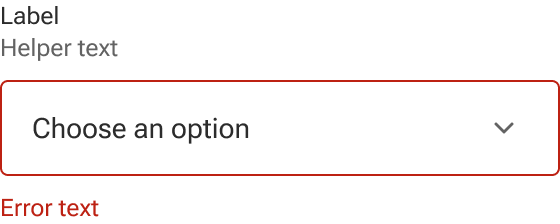
Error text wraps to a new line when it’s too long for the available horizontal space.
Read-only
Selects may be set to read-only for when form values need to be shown but shouldn’t be edited. Read-only content may still be copied by the user and hyperlinked content such as email addresses, URLs, and telephone numbers are still interactive. They are also part of the tab order and can receive focus.

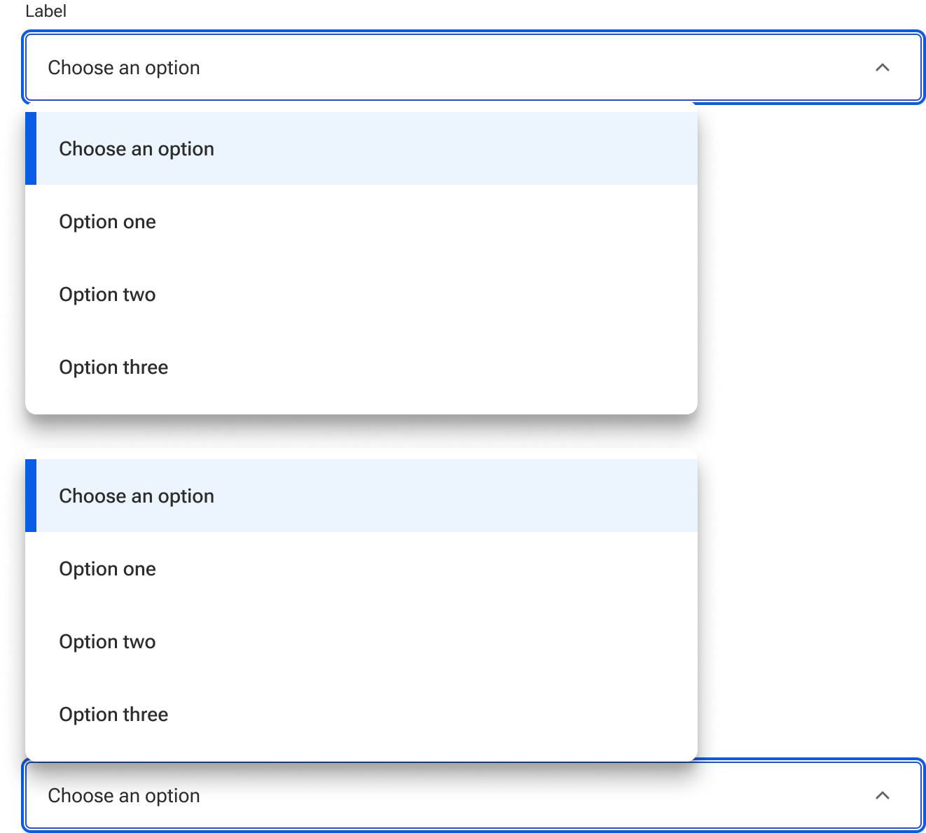
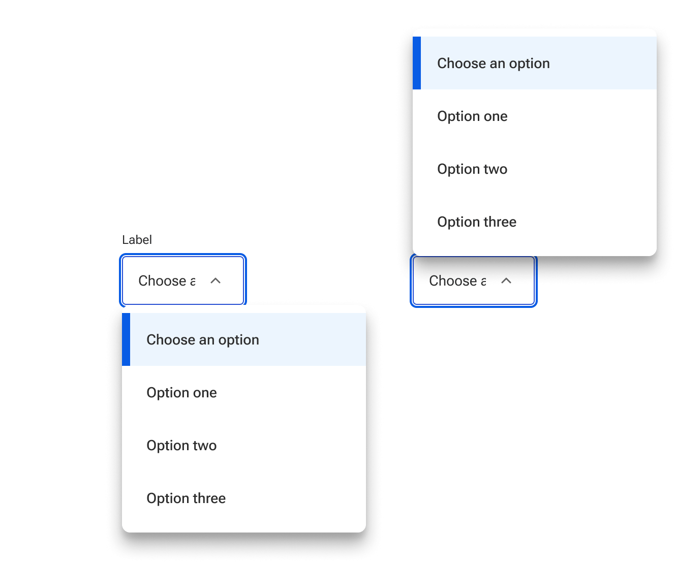
Menu flipping
By default, the menu will automatically flip to the position—either top or bottom—that allows it to expand as fully as possible. The behavior is based on the defined height of the menu in proximity to the edge of the viewport. This includes any max-height that is defined. It is not based on the proximity of the select’s input field.
This behavior can be disabled. When disabled, the menu is always positioned as defined by the user regardless of the select’s proximity to the viewport’s edge.