Divider
A divider creates visual hierarchy and rhythm within a layout by partitioning content into meaningful sections.
Code documentation
Anatomy
The divider component is made up of three elements.
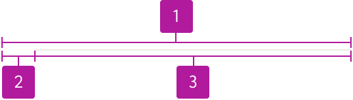
- Container
- Inset
- Border
Variants
Orientation
Horizontal
Horizontal dividers separate stacked content vertically. This is the default orientation.

Vertical
Vertical dividers separate content arranged side-by-side. Use between grouped controls, panels, or columns where spacing alone does not provide enough separation.

Appearance
Solid
Solid dividers provide the clearest, most consistent way of sectioning content on the page. Use in most situations.

Dashed
Dashed dividers create a softer boundary than solid. Use when separation is needed but the relationship is secondary. Use sparingly.

In code, appearance is set with the --jh-divider-border-style component token rather than a property.
Inset
Insets allow you to align the left edge of the divider’s visible border with adjacent content. The inset space can be manually set using a component token or by selecting from a predefined list of options that correlate to Forge’s spacing tokens which override the default and component token values.

Width
The default divider width of 1px should be maintained in most situations. However, in contexts where a thicker divider is warranted, a component token can be leveraged to manually adjust the divider’s width.