List item
A list item is a singular representation of an object or piece of data.
Code documentation
Anatomy
The list item component is made up of 8 elements.
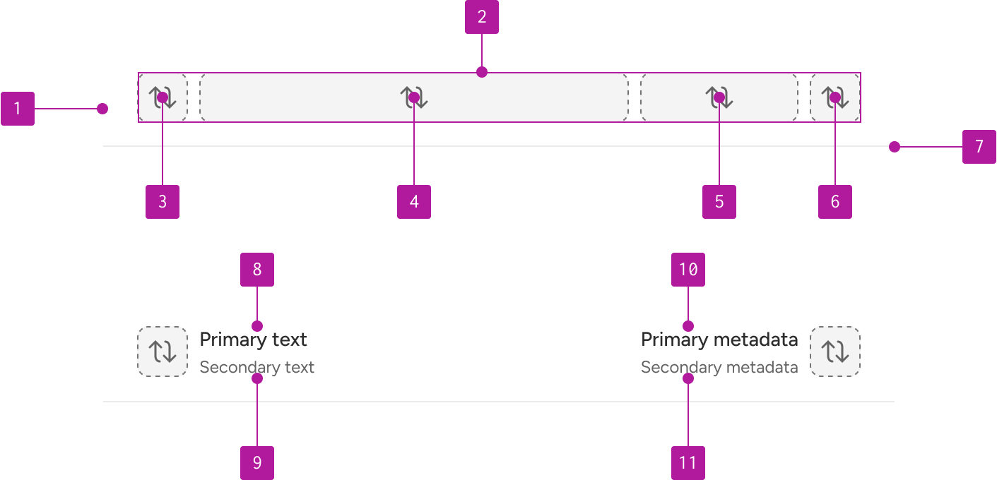
- Default slot
- Left slot
- Right slot
- Divider
- Primary text
- Secondary text
- Primary metadata
- Secondary metadata
Variants
Divider
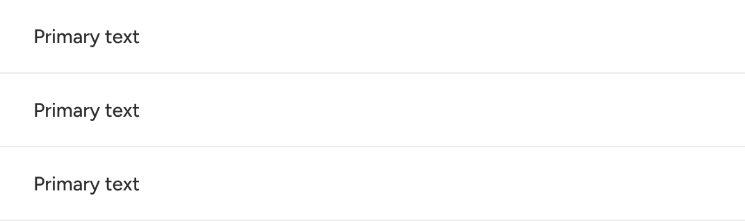
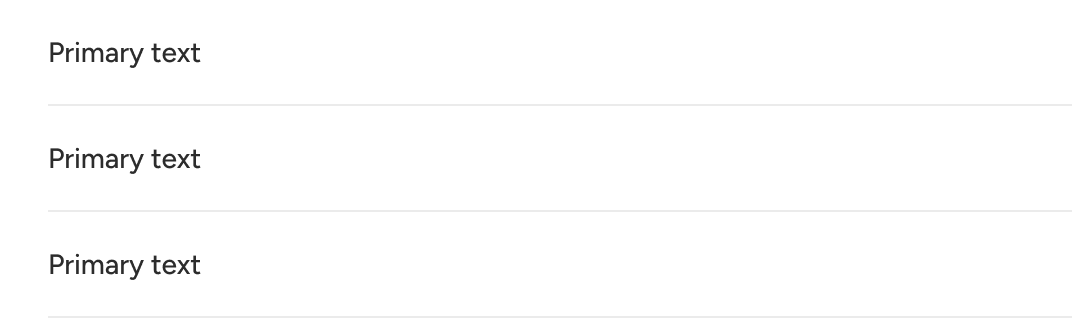
A divider can be used between list items to create visual separation or to help group similar options. An inset property is provided to set the distance from the left edge of the divider to the container.
Left slot
The left slot allows you to place relevant content at the start of the list item. There is no default content associated with this slot. The default behavior is for the slot to hug the content that is placed within it.

Default slot
The default slot is the primary location for placing content within a list item. By default, it can display primary and secondary strings of text plus primary and secondary strings of metadata. The text slot will expand to take up the remaining available space within the container.

Right slot
The right slot can be leveraged to include relevant content at the end of the list item. There are no defaults associated with the right slot. The slot will hug the content that is placed within it.

Primary text
Primary text should be included to label what the list item represents.

Secondary text
Secondary text may be included to provide supplemental information related to the primary text.

Primary metadata
A primary line of metadata may be included to provide additional information related to the list item.

Secondary metadata
A secondary line of metadata may be included to provide another level of information related to the list item.

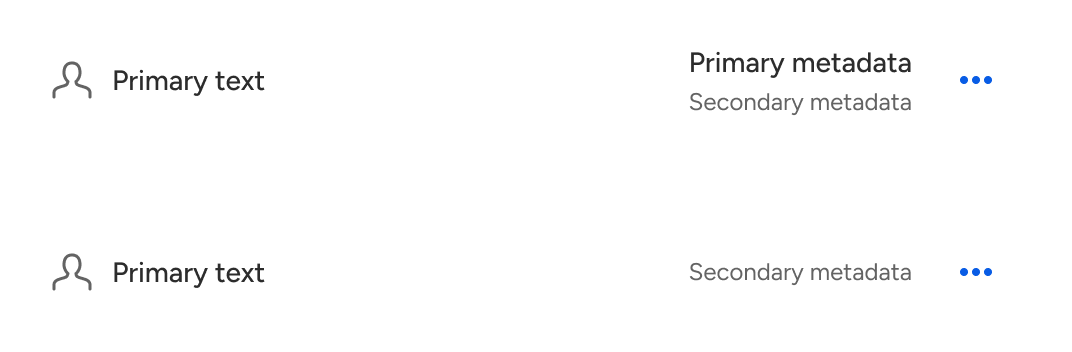
The secondary metadata can be displayed independent of the primary metadata.

Behavior
Size
List items dynamically resize to accommodate the height of their content while retaining a consistent padding within the container by default. A component token is available for users to explicitly set the list item’s height when greater control and consistency is required.

Text overflow
Text that is longer than than the available space within the main content container will wrap to the next line.
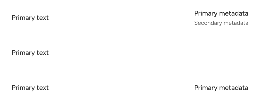
The metadata container expands to fit the content within it. The width of the metadata container is determined by either the primary or secondary metadata—whichever is longer.

Custom layouts can establish a different overflow pattern as needed.
Alignment
All default content is vertically centered within the list item container. Additionally, the metadata is horizontally aligned to the right of the metadata slot. Custom layouts may use different content alignments as needed.
States
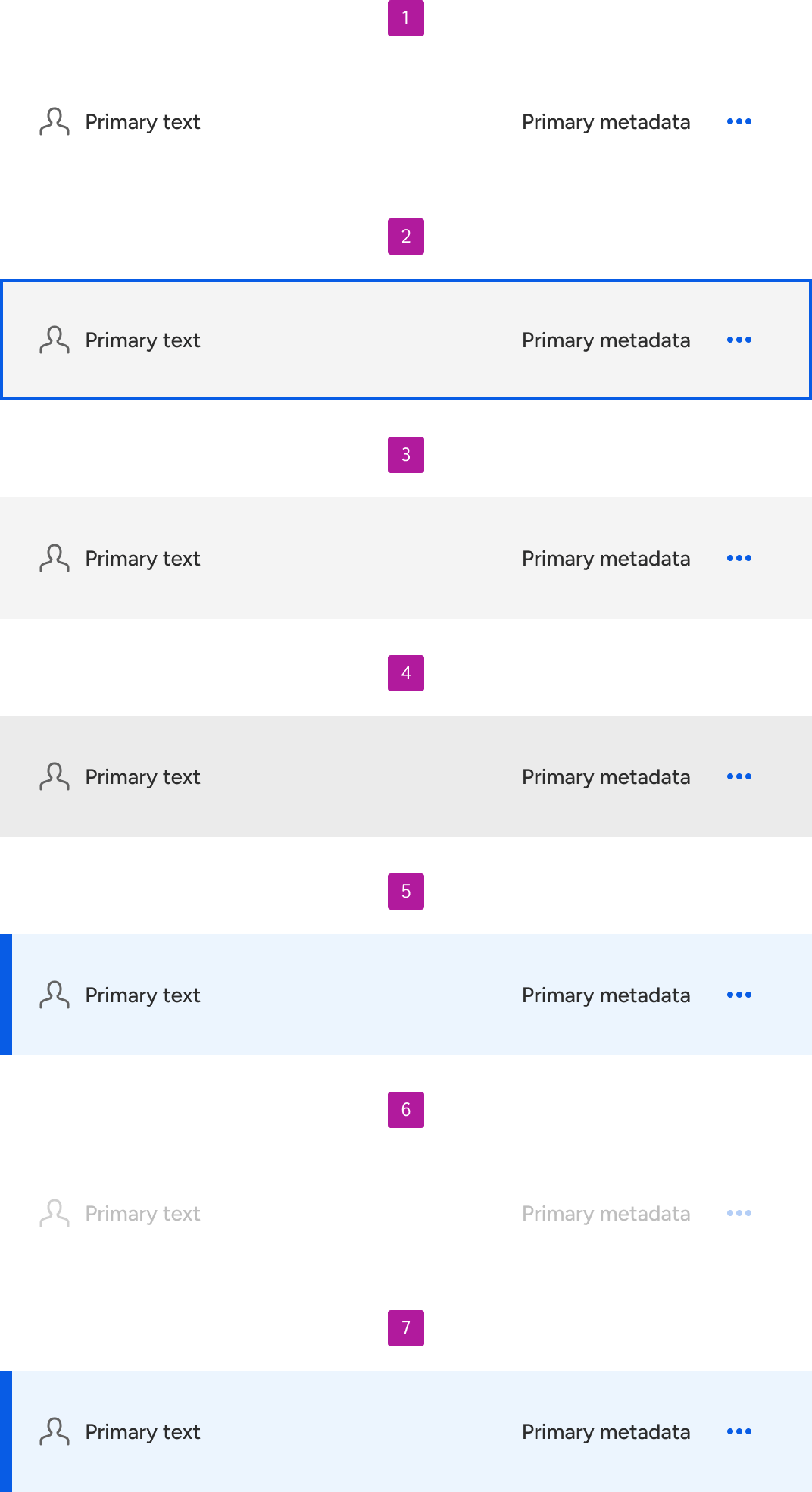
By default, list items do not have any states enabled. However, if a list item is made interactive, a set of default states will become present to indicate its interactive state. These include the following:
- Enabled
- Focus
- Hover
- Active
- Selected
- Disabled
- Selected disabled
Grouping
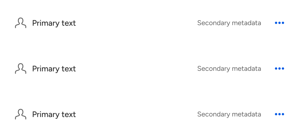
A list item can be used on its own if the situation warrants it. However, most list items will typically be grouped together to create a set of related data or items. When grouping list items together, use the list group component to provide the necessary structure. Consider using the list group to structure even a single list item; this will allow the freedom to easily add other list items down the road.
Figma
Frame constraints
Figma currently applies the fixed widths of slots to the fixed-width components that are swapped in. This means certain fixed-width components such as switch, radio, and checkbox won’t have much room to properly display a label or secondary text. To work around this quirk, simply set the horizontal resizing to hug the relevant layers.