Checkbox
Checkboxes allow users to select one or more options from a group of options.
Code documentation
Anatomy
The checkbox component is made up of four elements.
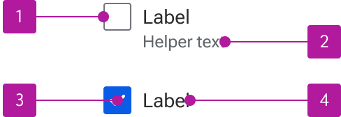
- Checkbox input
- Helper text
- Status mark
- Label
Variants
Label
Labels describe the purpose of the checkbox. The default label may be omitted provided an adjacent label is appropriately referenced to the field for accessibility purposes.

Helper Text
Helper text can be included alongside the label to provide additional context or guidance for using the control. A label is required for helper text to display.

Behavior
Text flow
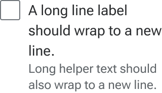
When labels wrap to multiple lines, the first line of the text should remain vertically centered with the control. Helper text should simply wrap to the next line.
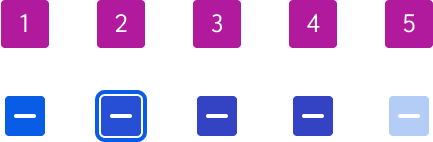
States
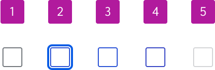
Checkboxes can be either unselected, selected, or indeterminate. Each of those statuses has five states:
- Enabled
- Focus
- Hover
- Active
- Disabled
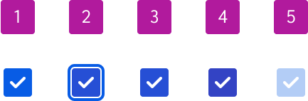
When a checkbox is in an indeterminate state, a subsequent interaction will send it to a selected state. Another interaction will send it to an unselected state.