Overview
Our design tokens are built with specific structures in mind that allow them to be incorporated and extended in a consistent and predictable manner.
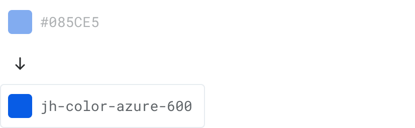
Global tokens
Global tokens are the most basic values within the visual language. They represent all of the visual choices available within the design system. Use global tokens when an appropriate alias token doesn't exist.
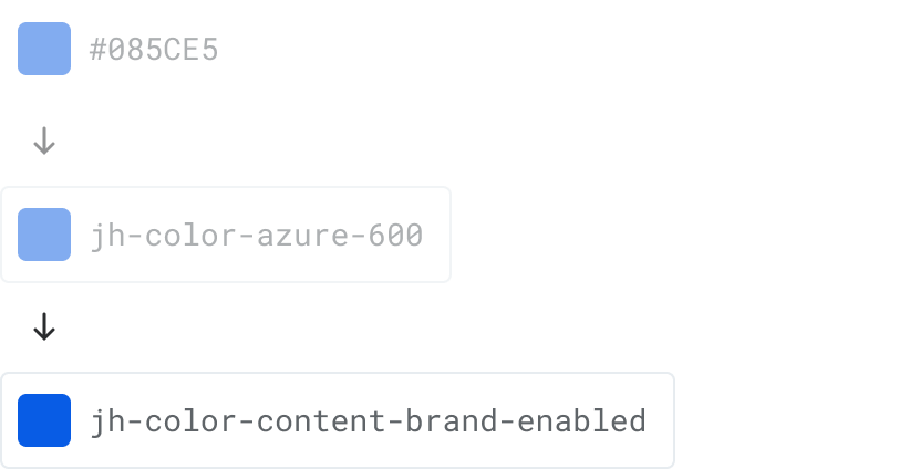
Alias tokens
Alias tokens communicate the specific function or purpose of a global token.
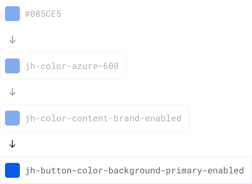
Component tokens
Component tokens are essentially alias tokens that are highly contextualized to a specific component. When used, component tokens allow you to override or theme very specific aspects of a given component.
Naming structure
Each design token follows a naming convention to provide an appropriate level of specificity and context so a user can have a better understanding of its intended use.
{system}-{component}-{element}-{category}-{concept}-{property}-{mode}-{variant}-{state}-{scale}
- System: The system level is a short designation of which library the tokens belong to.
- Component: Component contextualizes the token to a specific component such as card or button.
- Element: Element targets a specific element within a component such as a label or icon.
- Category: Category describes a specific visual style concern such as color, font, and size.
- Concept: Concept further breaks down a given category into semantic subdivisions.
- Property: Property contextualizes a token to a standard CSS property such as background, border, or text.
- Mode: Mode denotes specific color pairings with an "on" designation.
- Variant: Variant describes alternative use cases for a base token such as primary, secondary, or success.
- State: State describes interactive states for a token such as hover, active, or disabled.
- Scale: Scale denotes graduated steps of a token variant, typically specified as ordered levels.
Levels can be skipped if not needed to clarify a token's usage. However, levels should always be placed in the aforementioned order.
The following are a few examples of tokens and their underlying structure:
jh-shadow-100
{system}-{category}-{scale}
jh-color-content-on-brand-enabled
{system}-{category}-{concept}-{mode}-{variant}-{state}
jh-button-icon-color-fill-primary-hover
{system}-{component}-{element}-{category}-{property}-{variant}-{state}
To ensure consistency and compatibility, product-specific tokens should follow the same naming conventions albeit with an appropriate system name that prevents collisions with the design system's jh- tokens.