Progress
A progress indicator provides feedback to a user regarding loading and waiting states.
Code documentation
Anatomy
The progress component is made up of four elements.

- Label
- Value
- Track
- Indicator
Variants
Type

Linear
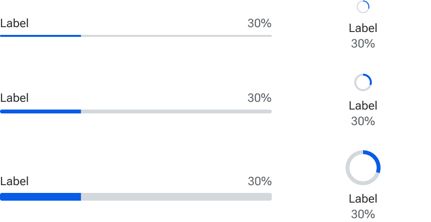
Linear progress indicators are the default and best used when multiple progress indicators are present such as a queue of file uploads. The can also be used when vertical space is limited
Circular
Circular progress indicators work well in situations where there there is only one progress being displayed in a given context, such as a card’s loading state. They also tend to work better than linear progress indicators when horizontal space is limited.
Size

Small
Small progress indicators should be used to show progress inline with another component or within confined spaces such as card headers.
Medium
The medium progress indicator is the default and used when there is ample space available.
Large
Large progress indicators indicate loading within main sections of the interface such as cards and dialogs.
Label
Labels provide context about the loading process being performed. While labels do not have to be visually displayed, each progress indicator must have a label defined in the code for accessibility purposes.

Value
Values provide information about the progress such as percent complete or amount of data loaded. Indeterminate progress indicators do not display a value.
The value can be displayed with or without the label.

Indeterminate
Indeterminate progress indicators should be used when the progress cannot be calculated such as syncing processes or reconnecting to a server.
