Menu
A menu is a self-contained list of actionable choices.
Code documentation
Anatomy
The menu component is made up of two elements.
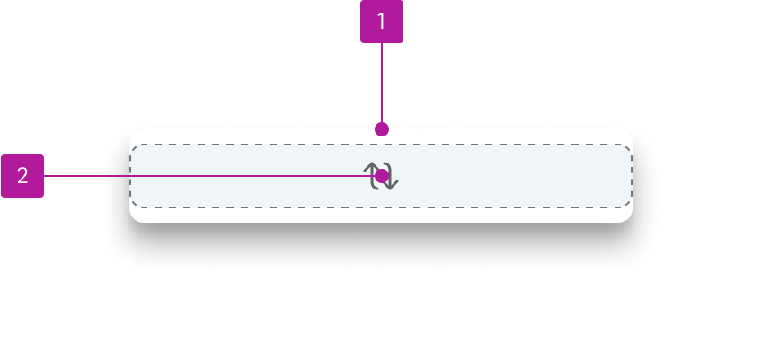
- Container
- Default slot
Behavior
Height
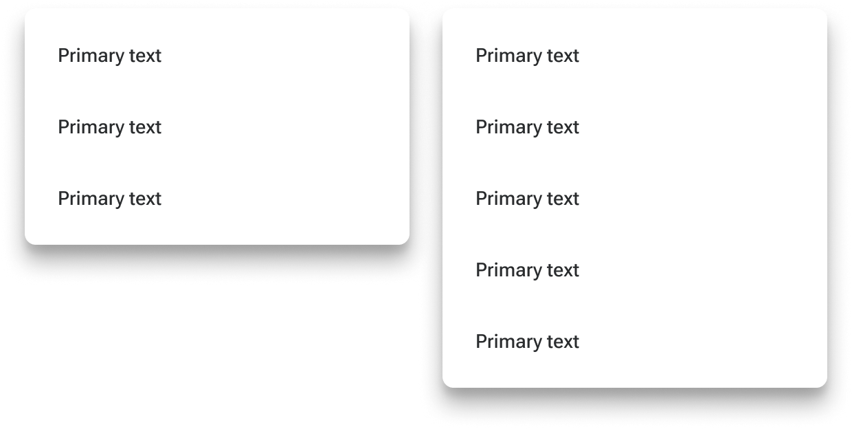
Menus grow in height to accommodate their contents.
Padding
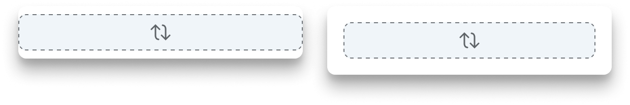
By default, menus have no padding. Padding can either be defined within custom slot layouts or added to any of the slots via component tokens. The component tokens recognize CSS shorthand, so specifying one value will define all of the sides with the same value whereas defining a component spacing token with four values (or tokens) will override each side discretely.
Figma
Custom layouts
The menu component is designed to accommodate custom content and layouts within its default slot. To make the most of this structure, we recommend adding relevant menu “micro-layouts”. You can then swap the placeholder with one of these layouts to create a custom menu. If that particular menu will be used in multiple places throughout your UI, you can then componentize that specific menu with the content in place so it can be consistently reused.
Padding
Padding may be applied to each individual side of the default slot to accommodate custom layout considerations. These can be set on the menu-default-wrapper layer.