Card
Cards are versatile content structures that group related concepts and tasks together as well as provide an entry point to more complex and detailed information.
Code documentation
Anatomy
The card component is made up of nine elements.
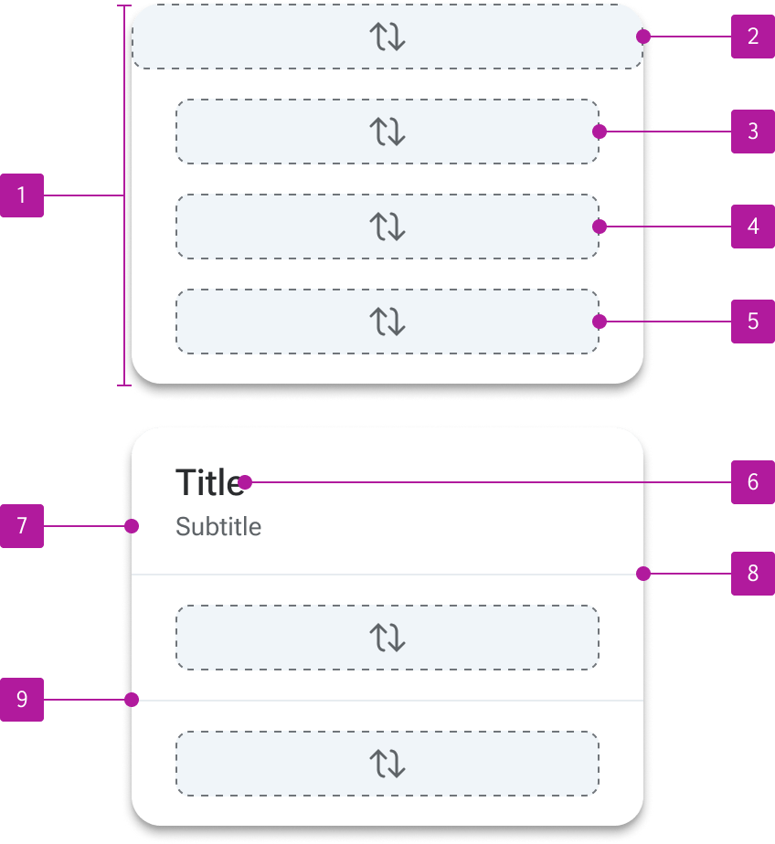
- Container
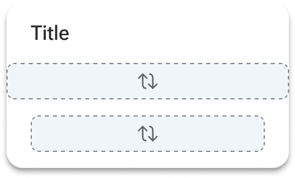
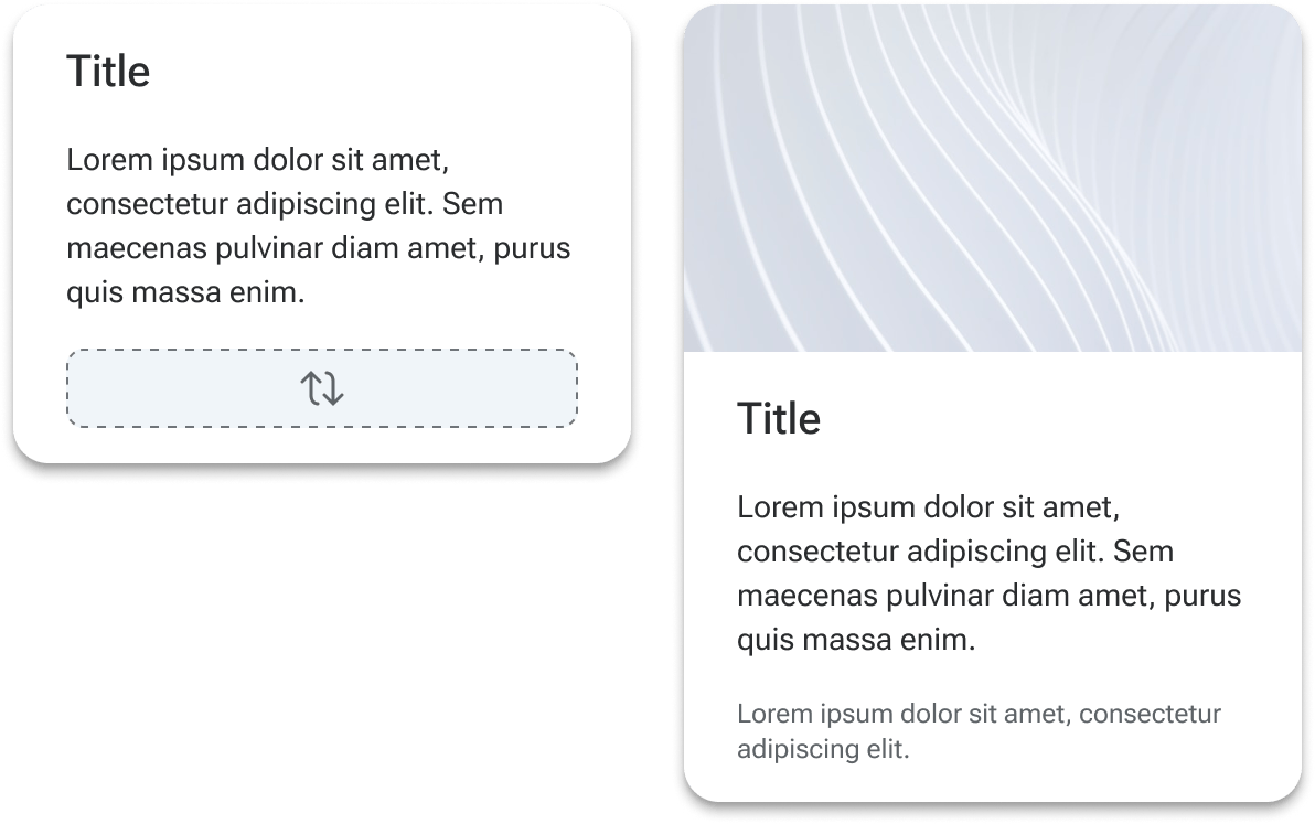
- Media slot
- Header slot
- Default slot
- Footer slot
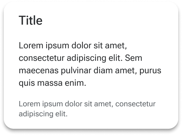
- Title
- Subtitle
- Header divider
- Footer divider
Variants
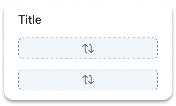
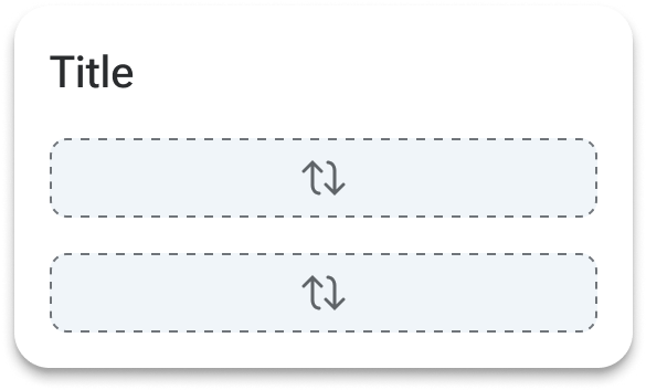
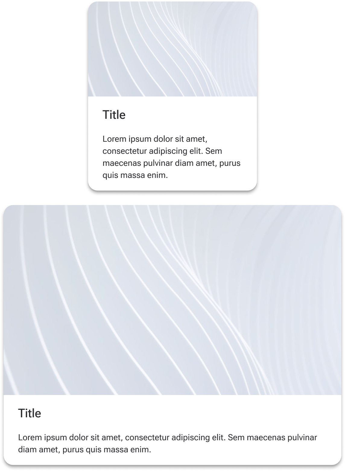
Media slot
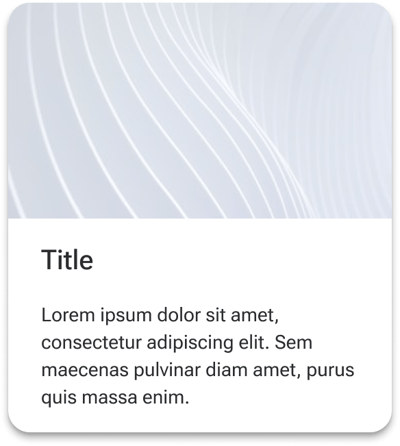
The media slot allows any type of rich media to be placed at the top of the card. Media can include imagery, video embeds, map embeds, or data visualizations. Custom media layouts can be created and placed within the media slot.
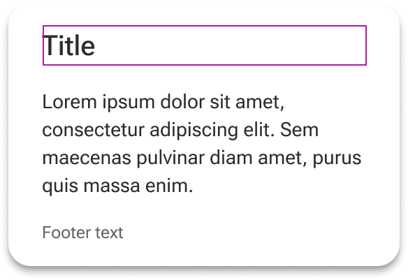
Header slot
The header slot is a container that is positioned at the top of the main content area and spans the full width of the card. A default layout includes a title and subtitle within the header slot, but it may be customized as needed.
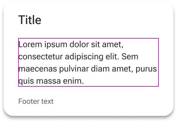
Default slot
The default slot is a basic container that sits between the header and footer and allows for complete customization of the card’s body content. Text styling is applied to the slot itself to allow for quick insertion of basic text content, but can accommodate a variety of custom layouts and configurations based on the content requirements.
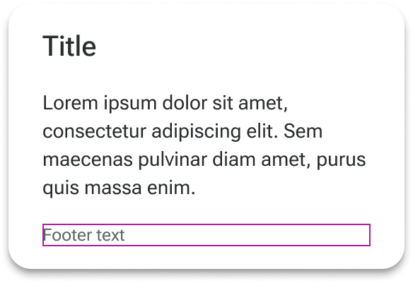
Footer slot
The footer slot is positioned at the bottom of the content and allows for custom footer layouts. Default styling is applied to the slot to allow for consistent treatment of basic text.
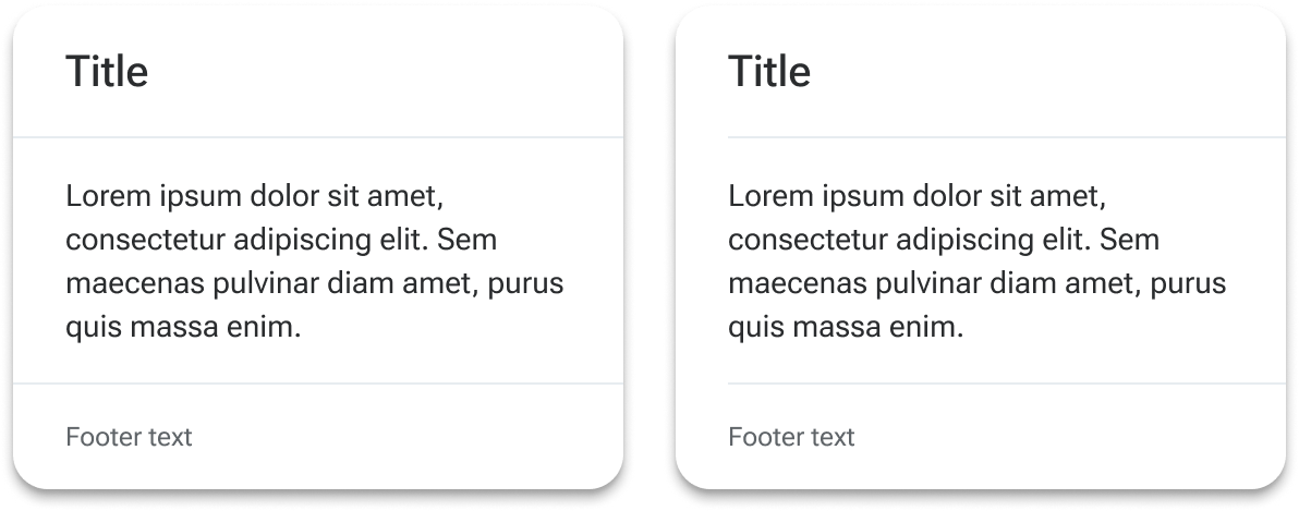
Dividers
Dividers can be independently added below the header and above the footer. This can help create clearer definition between complex body content and the rest of the card. The dividers can have insets applied to align them to card content as needed.
Padding
By default, cards have medium padding applied to slots to ensure content can be added without butting up against the edges of the container. A more modest padding can be applied using the small preset, while the padding surrounding the default slot can be completely removed with the none preset. Component tokens are available for fine-grain control of padding when needed.
Behavior
Text overflow
All text within the card’s predefined slots automatically wraps to a new line and forces its containers to grow to fit it.
Media scaling
Media placed within the media slot scales according to its intrinsic aspect ratio. However, custom aspect ratios can be set via component token and media will scale to fill the container.
Height
Cards grow in height to accommodate the content of the card.
Figma
Custom layouts
The card component is designed to accommodate custom content and layouts within each of its slots. To make the most of this structure, we recommend adding a series of relevant card “micro-layouts” (headers, body content, footers, etc.) to your product library. You can then swap the placeholder with combinations of these layouts to create a custom card. If that particular card will be used in multiple places throughout your UI, you can then componentize that specific card with the content in place so it can be consistently reused.
Padding
General padding can be set for the card using the padding property. These options apply broad-level padding settings to the entire card. However, custom paddings may be applied to each individual side of each slot to accommodate specific layout considerations. These can be set on the following layers:
- card-media-wrapper
- card-header-wrapper
- card-default-wrapper
- card-footer-wrapper
When making overrides to the padding, use variables based on the system's spacing tokens.
Media slot
One known Figma quirk is that images set using the aspect ratio component within the media slot will not persist between card variants. It’s recommended that you establish the variant you want to use (including padding and dividers) and then set your image.
While the card has its own border radius that can be set, the media slot can also have its own border radius applied. This can help accommodate circumstances where the image is inset and needs rounded corners. In Figma, select the card-media layer and adjust the border radius as needed. Note that, when implemented into code, this isn't applying a border radius to the slot itself. Rather, the radius is applied to whatever content is being placed into the slot (ex., an <img> element).