Components
Components are the systematic building blocks of our design system that empower users to create consistency across their products.
A badge is a visual indicator that represents numeric values such as counters.
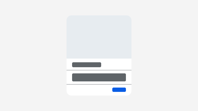
Cards are versatile content structures that group related concepts and tasks together as well as provide an entry point to more complex and detailed information.
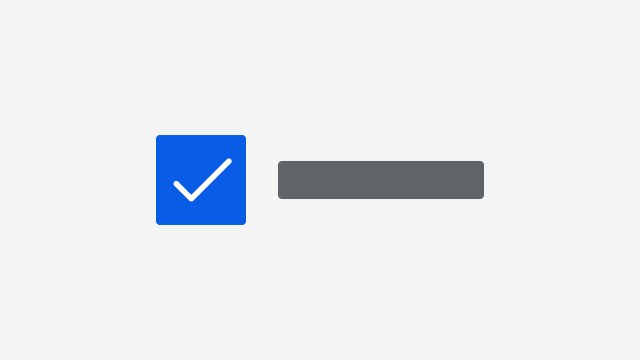
Checkboxes allow users to select one or more options from a group of options.
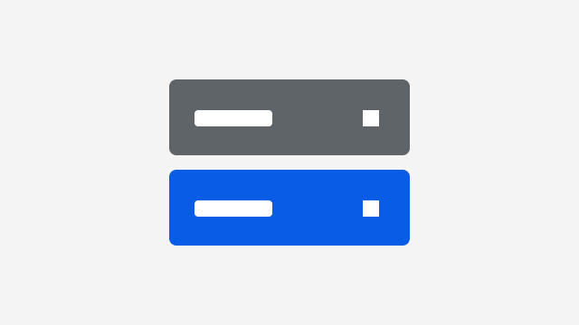
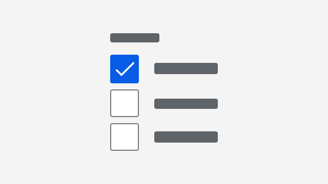
Checkbox groups display a related set of options where multiple options can be selected.
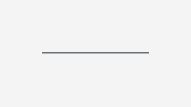
A divider creates visual hierarchy and rhythm within a layout by partitioning content into meaningful sections.
Icons are graphic representations of concepts and actions that help establish context and purpose for other user interface elements.
A list group organizes related list items into a contained unit.
A list item is a singular representation of an object or piece of data.
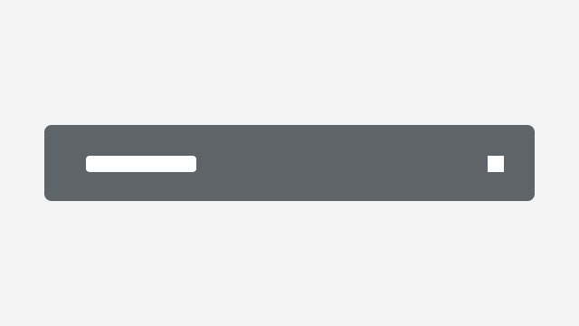
A notification communicates to a user timely or important information.
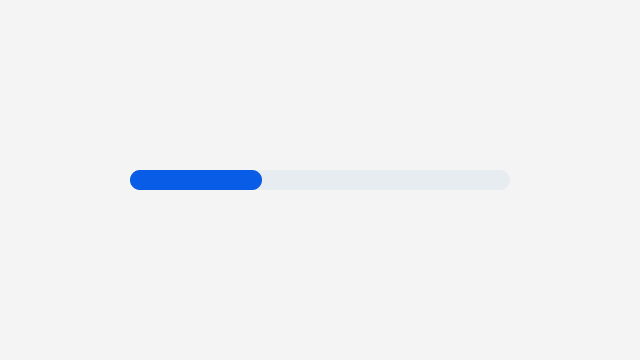
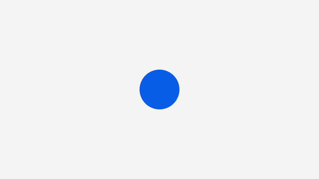
A progress indicator provides feedback to a user regarding loading and waiting states.
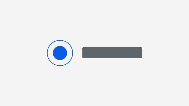
Radios allow users to select only one option from a group of two or more options.
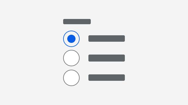
Radio groups display a related set of options where only one option can be selected.
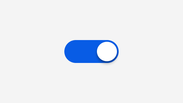
A switch allows users to select between one of two opposing states or options.
Tags represent keywords, categories, or other labels that serve to classify adjacent content.
Tag groups display a collection of tags.
A toast is a temporary notification that informs users on the outcome of an action.
