Input - Textarea
The input textarea component provides a multi-line text field that allows users to submit detailed, unstructured, free-form text.
Code documentation
Anatomy
The textarea input component is made up of 11 elements.
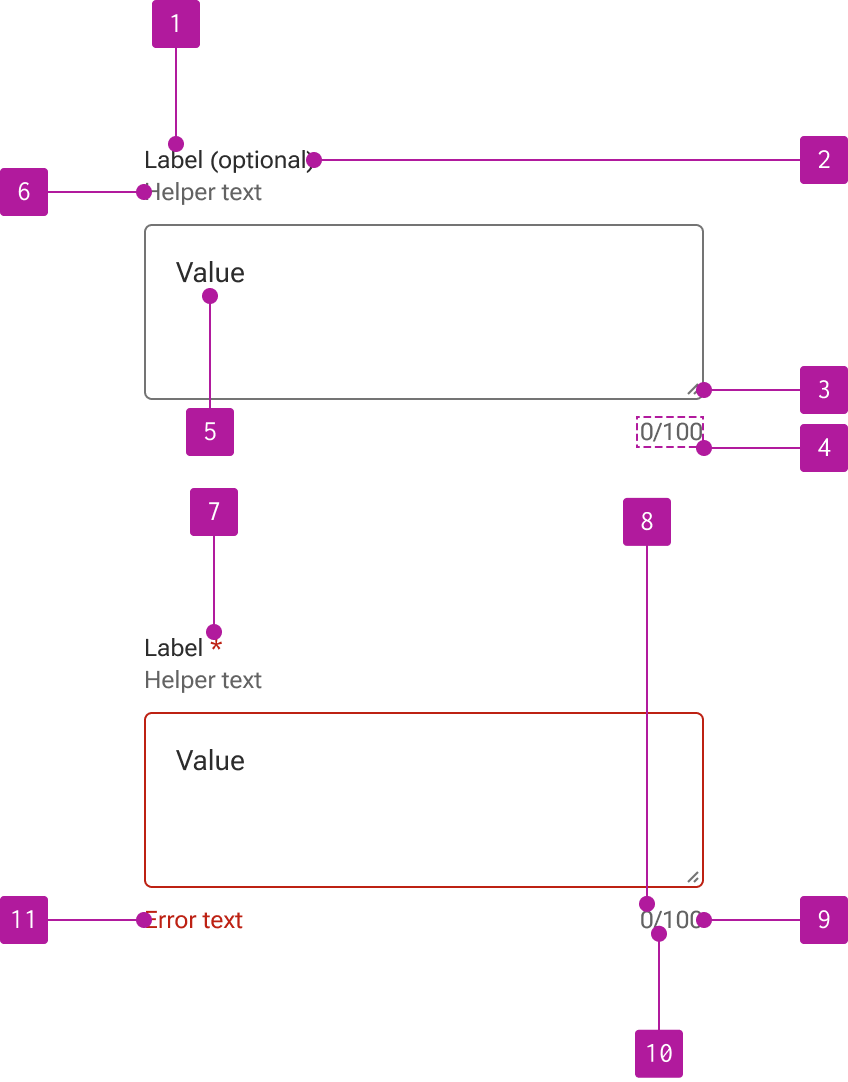
- Label
- Optional indicator
- Resizer
- Counter
- Value
- Helper text
- Required indicator
- Current value length
- Max value length
- Counter divider
- Error text
Variants
Input textarea extends the input component which allows for the use of its properties, events, slots, methods, and styles. Refer to the input documentation for detailed information on these features.
The following variants are unique features to input textarea.
Columns
Similar to the native HTML textarea element, the width of an input textarea can be defined via number of columns within the input field. A column width based on an average character width.
Alternatively—and perhaps more precisely—the width of an input textarea can be defined using standard CSS styling.
Rows
In addition to columns to define the width, input textarea allows for rows to define the height of the input field. The row height is based on the overall height of the text line. It’s important to note that the textarea field’s minimum height will override the number of rows specified if the height defined by the number of rows is less than the minimum height value.
CSS styling can also be used to adjust the height of an input textarea.
Wrap
Wrap specifies how text should be wrapped when submitted in a form. There are two available options: 1) hard and 2) soft. Both options follow the same behaviors as their native HTML equivalents. Neither option affects the design of the component itself.
Resize
By default, a textarea cannot be manually resized by the user.

However, a resizer can be displayed as needed to allow users to resize the height of the textarea field to more easily work with longer content.

Slots
The textarea doesn't provide any slots within the input field.
Behavior
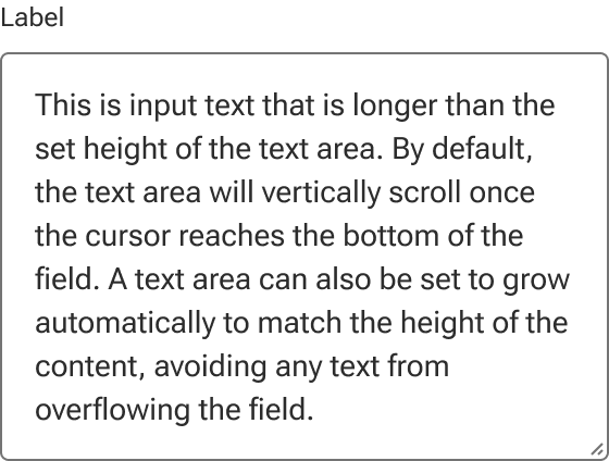
Scroll
Be default, a textarea vertically scrolls to accommodate text that overflows the textarea’s boundaries. If the resizer is enabled, the dimensions of the textarea can be resized by the user to allow more content to display.
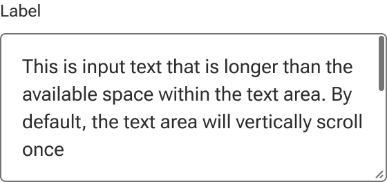
Auto grow
A textarea can also be set to automatically grow to match the height of the content. A resizer can still be used with auto grow to momentarily override the dimensions of the textarea. However, any change to the input text will cause the textarea to “snap” back to the height of the content.
When auto grow is set, the scrollbar will not display even if the field is momentarily resized to crop the text.