Focus
A focus indicator is an important part of the user interface that helps users know which element on the page currently has keyboard focus.
When correctly implemented, a focus indicator can help users navigate a page's interactive elements more effectively. Because of this, the focus indicator is built in to all of the components that are interactive by default. It incorporates our design tokens to ensure appropriate color contrast and that the indicator styling complements the rest of the visual language used throughout the system.
The tokens also allow the indicator to be themed or customized to meet color contrast guidelines when used in situations outside the norm.
Because focus indicators play such an important role in the overall usability of a web application, they should always remain visible when an applicable element has focus. If you are creating a new component that will receive keyboard focus, be sure to include the focus indicator styling as part of your design and code.
Structure
The ring is the main element of the indicator and should always be present on interactive elements when they receive focus. By default, it conforms to the border radius of its related element and is slightly offset.
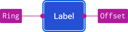
There are some situations—such as when elements don’t have a visible container—where an offset may not be needed. In those cases, you may use a negative offset to align the ring to the inside of the element or omit the offset altogether.

The following code example details how we typically implement the indicator in CSS:
element:focus-visible {
  outline-color: var(--jh-border-focus-color);
  outline-style: var(--jh-border-focus-style);
  outline-width: var(--jh-border-focus-width);
  outline-offset: 1px;
}
When creating custom components, the various outline properties can also be written in CSS shorthand if preferred.
Figma
To ensure a focus indicator is accessible, it is generally implemented using the CSS outline property. However, Figma doesn't have an equivalent property to design with. As such, we represent the focus styling with a special utility component named jh-focus-ring. This allows us a way to handle the offset as well as allow the indicator to work in conjunction with elements that also include border styling as part of their design.
The component allows for positive and negative offsets which are accomplished using a special boolean group. The "outline" layer represents outline-color, outline-style, and outline-width. The "outline-offset" layer represents outline-offset.
The focus ring component is included as a separate layer on all design system components that have a focus state. However, there may be situations when the focus ring component creates unintended behaviors within your layout. In these cases, you can hide the focus ring layer (or use the enabled state) and design a custom focus state using the available tokens and/or manually positioning the focus ring component. Be sure to communicate with engineers any customizations that deviate from the standard focus styling and behavior.