Table - Row
The table row defines a row of cells in a table.
BetaThis component is new in v2.
Code documentation
Anatomy
The table row component is made up of one element.

- Default slot
The table row component is part of a collection of related components that are used for composing tables. These include table, table header cell, and table data cell.
Variants
Default slot
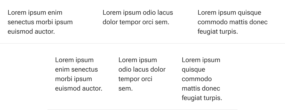
The default slot is used to insert table data cells into the row. The slot accommodates any number of cell components.

By default, cells equally grow to fill their row container. The cell widths can be overridden to have fixed or other relative widths as needed.
Behavior
States
Table rows have two available states:
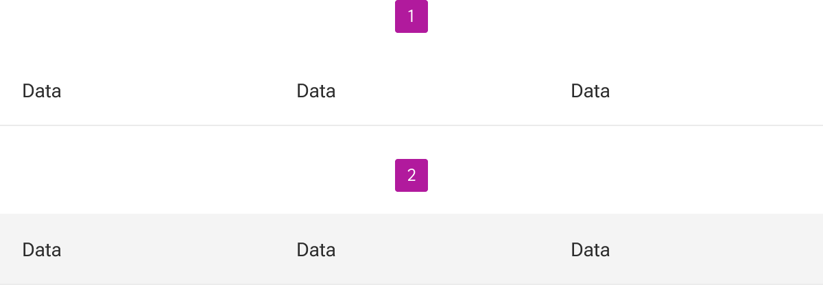
- Enabled
- Hover