Table - Header cell
The table header cell is an individual cell that stores the tabular header.
Code documentation
Anatomy
The table header cell component is made up of two elements.
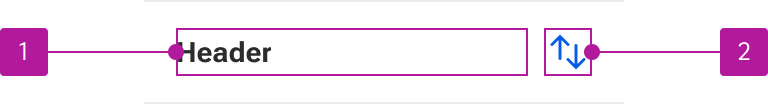
- Default slot
- Icon
The table header cell component is part of a collection of related components that are used for composing tables. These include table, table row, and table data cell.
Variants
Horizontal alignment
The horizontal alignment can be set for the content slotted within the cell.
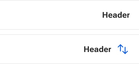
Left
Left alignment horizontally aligns the slotted contents to the left side of the cell.
Center
Center alignment horizontally aligns the slotted contents to the center of the cell.

Right
Right alignment horizontally aligns the slotted contents to the right side of the cell.
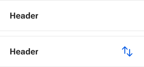
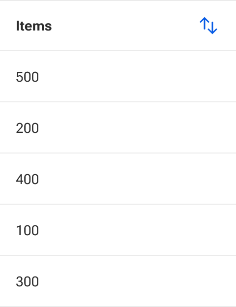
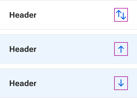
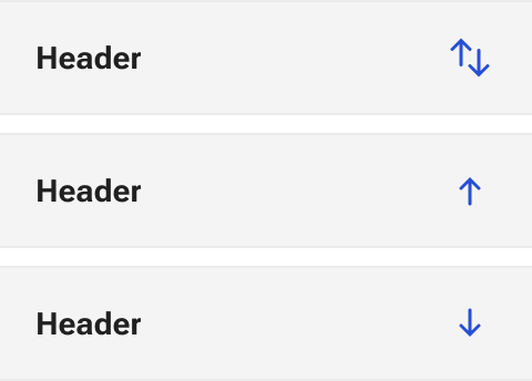
Sortable
When enabled, a column as defined by a header cell can be sorted. Any number of columns within a table can be set as sortable.

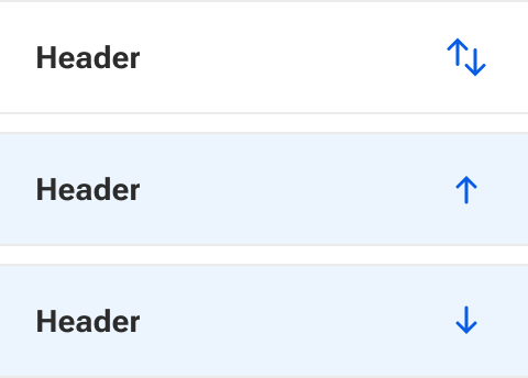
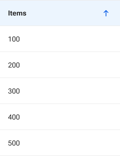
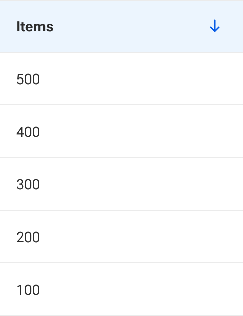
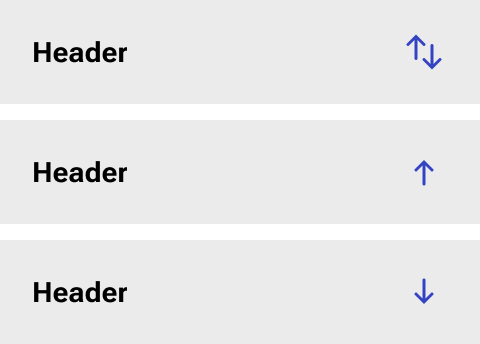
Sorted
The sorted property sets the method by which a given column is sorted.
When a user clicks a sortable header, it cycles through a set order of options. By default, a column is set to none. Each click on the header progresses then to ascending, then descending, and then back to none. If the sorted property is set to something other than none, the cycle starts at that point.
None
None doesn’t apply any sorting method to the column. However, data can still be manually sorted before it is rendered into the table.
Ascending
Ascending orders data rows from the smallest/lowest value at the top to the largest/highest value at the bottom.
Descending
Descending orders data rows from the largest/highest value at the top to the smallest/lowest value at the bottom.
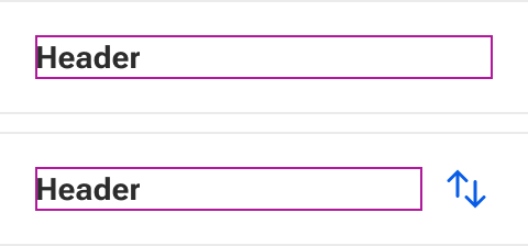
Default slot
The default slot is used to insert the cell contents. This only slots content into the main text area. The sort icon is not affected and is always present when enabled. Default styling is applied to basic text. However, complex data configurations and stylings can be inserted as needed.
By default, text that is longer than the available space within the default slot will wrap to a new line. The cell vertically grows to accommodate the height of the slotted content.
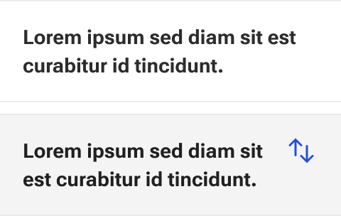
Icon slots
There are three icon slots available to insert a custom icon for each of the sorting methods: none, ascending, and descending.
Behavior
Table header cells have five available states.
States
Enabled

Focus
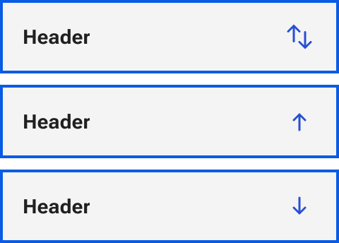
Hover
Active
Selected