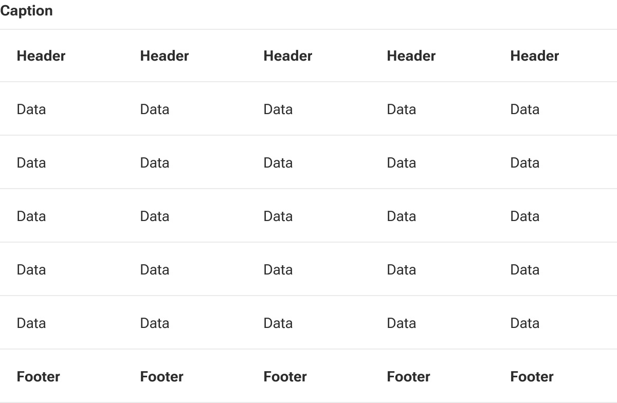
Table
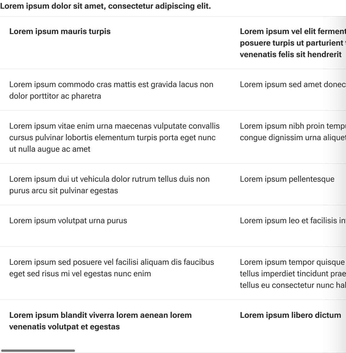
Tables display data in rows and columns to promote easier comparison and analysis.
Code documentation
Anatomy
The table component is made up of nine elements.
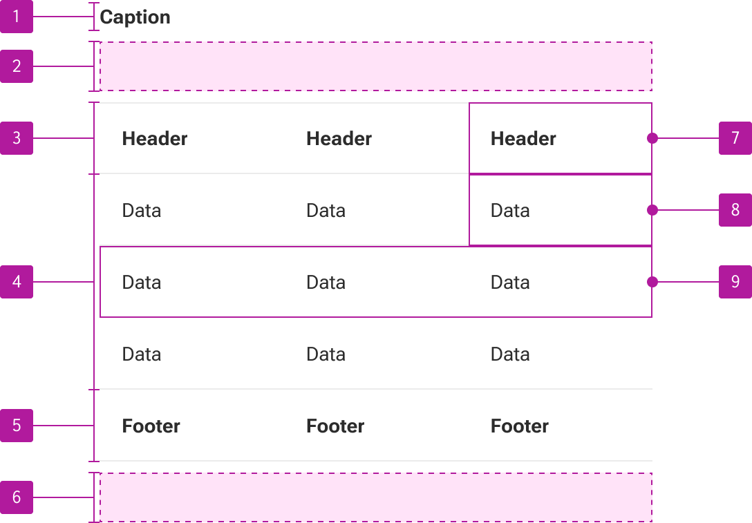
- Caption slot
- Toolbar slot
- Table head slot
- Default slot
- Table foot slot
- Pagination slot
- Table header cell
- Table data cell
- Table row
The table component is part of a collection of related components that are used for composing tables. These include table row, table header cell, and table data cell.
Variants
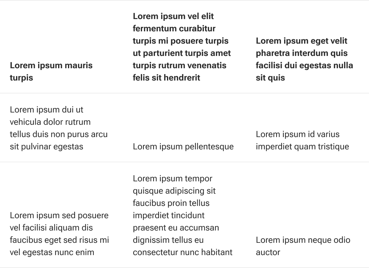
Vertical alignment
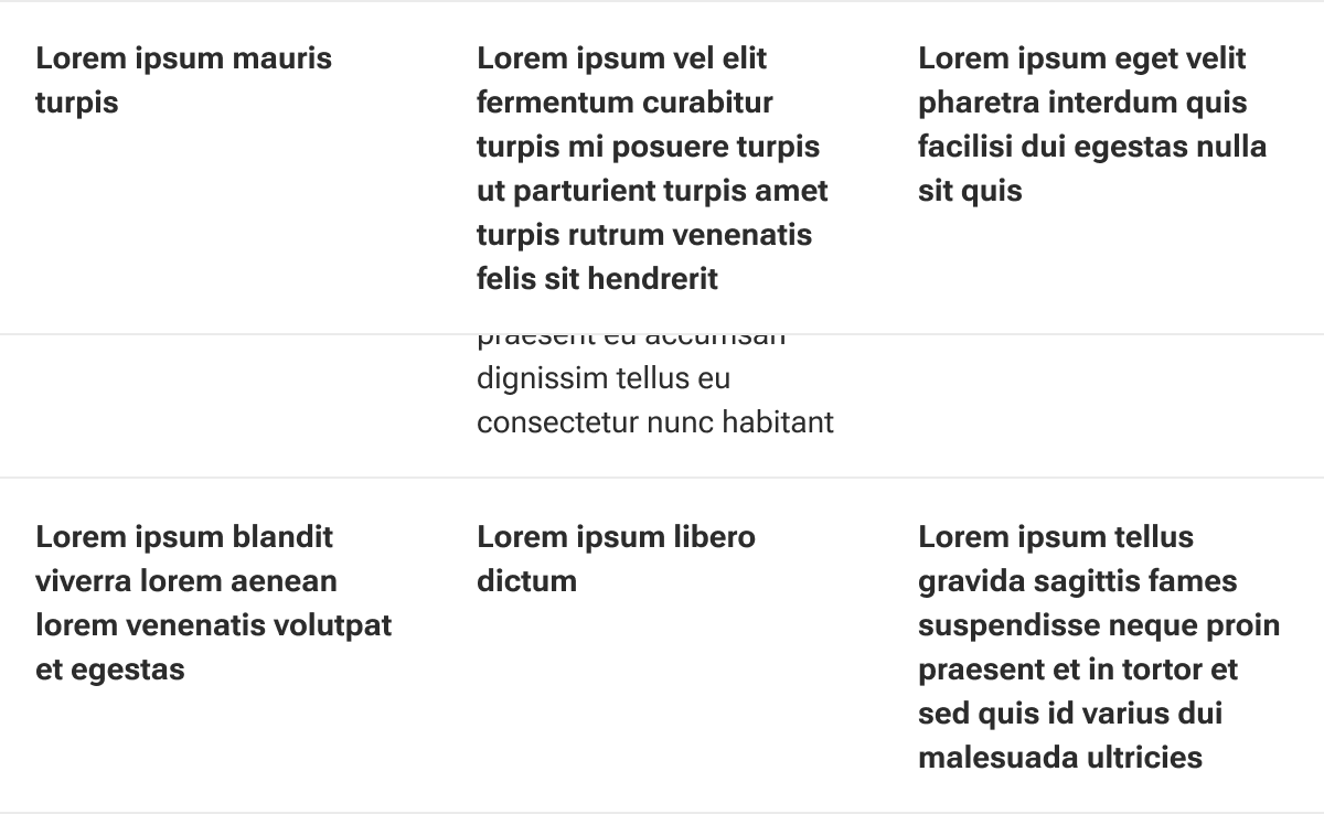
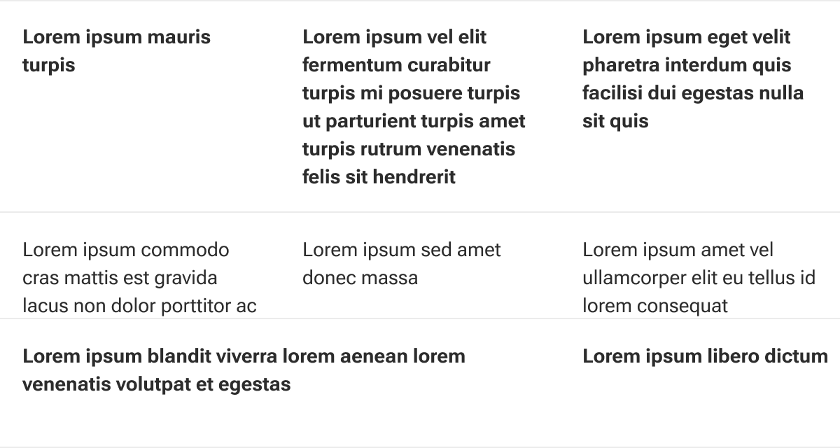
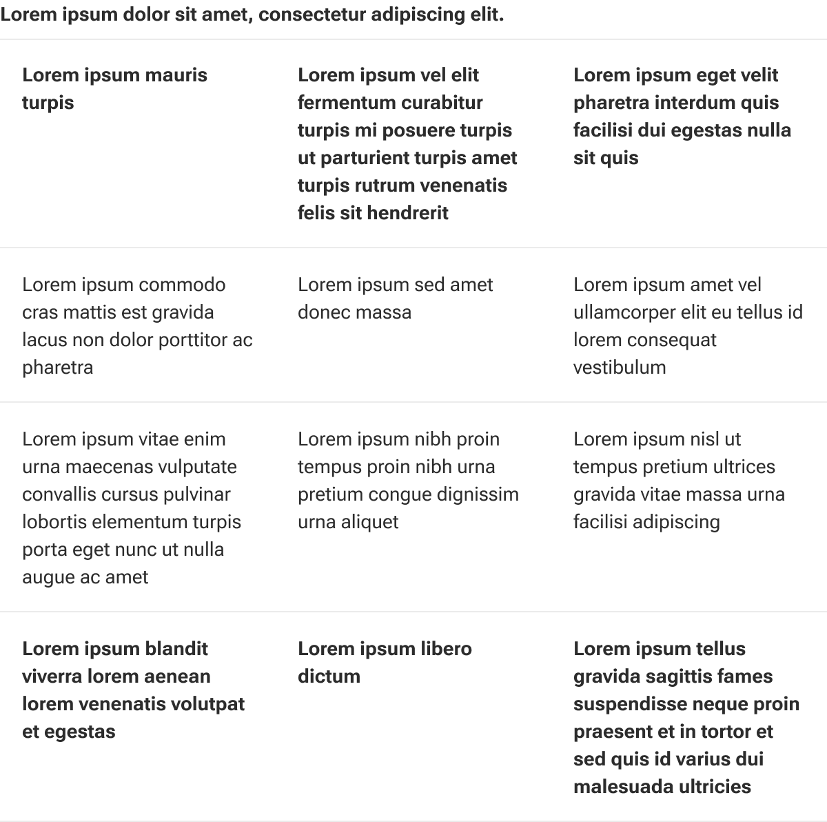
Vertical alignment determines how content is positioned within a cell. Alignment is applied to each cell within the table including header and footer cells.
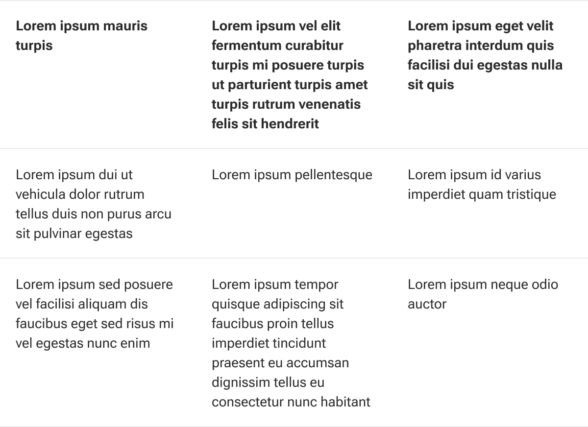
Top
Setting the vertical alignment to the top vertically aligns the slotted contents to the top of the cell.
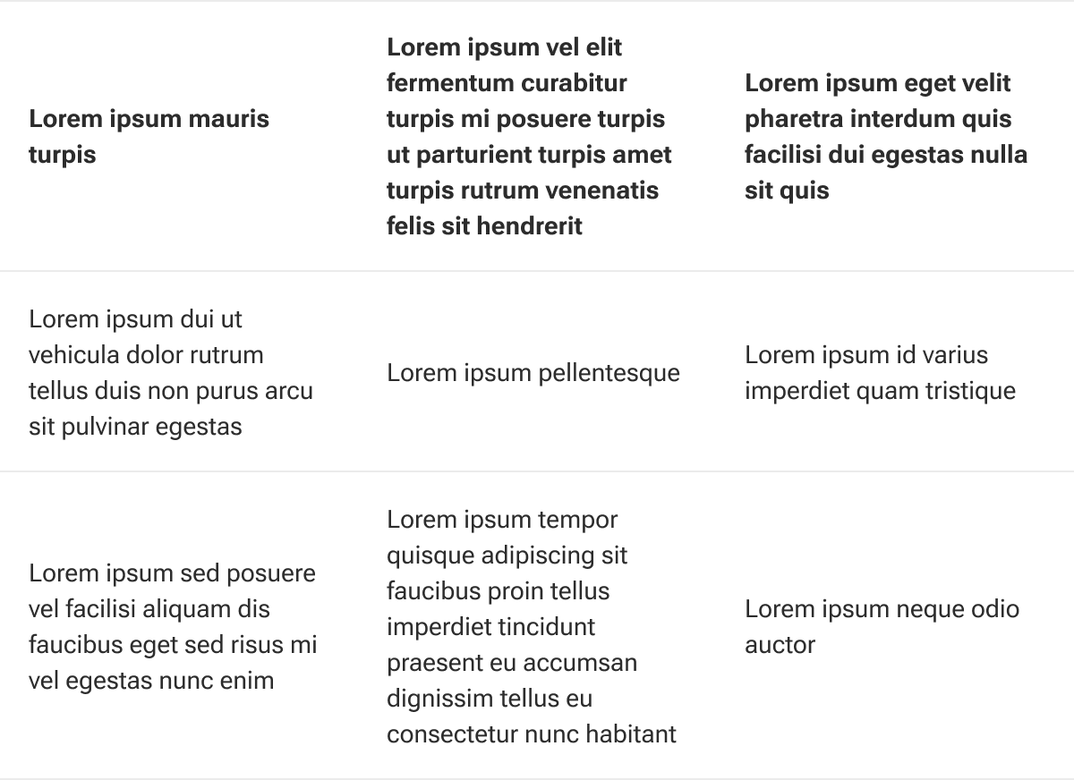
Middle
Setting the vertical alignment to the middle vertically aligns the slotted contents to the middle of the cell.
Bottom
Setting the vertical alignment to the bottom vertically aligns the slotted contents to the bottom of the cell.
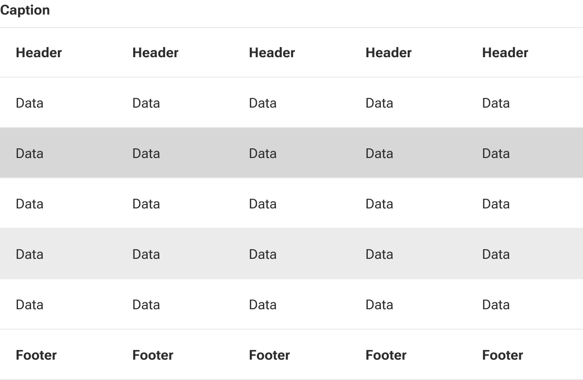
Striped
When enabled, table rows will alternate background colors. Striping begins on the second body row and alternates every other row. Striping is not applied to the rows within the head or foot.
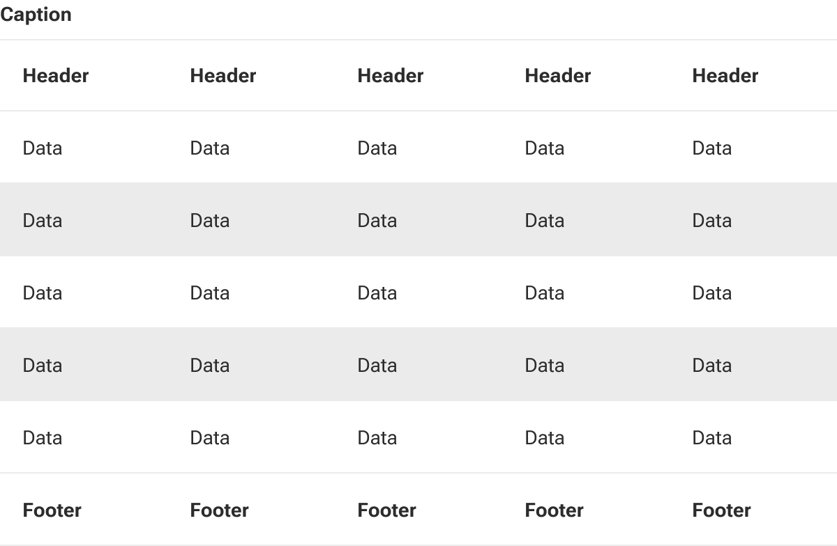
Rows with striping can still receive hover for wayfinding.
Padding
Padding adjusts the table’s cell padding to allow more or less white space within the rows.
Small
Small padding reduces the amount of cell padding throughout the table to conserve space.
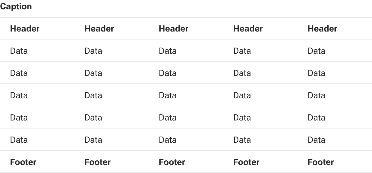
Medium
Medium padding applies a moderate amount of cell padding to the table giving a bit more breathing room around cell data. This is the default setting.
Sticky header
The table’s header can be fixed in place allowing the head row to remain visible when vertically scrolling long tables.
Sticky footer
The table’s footer can also be fixed in place to better accommodate vertically scrolling long tables.
Scrollable
By default, tables auto-resize to fit within the parent container. At narrow widths (particularly mobile layouts), this may create aggressive wrapping of cell content.
However, a table can be set to horizontally scroll when it is wider than its container. This allows data-rich or otherwise particularly wide tables to still be readable at smaller breakpoints.
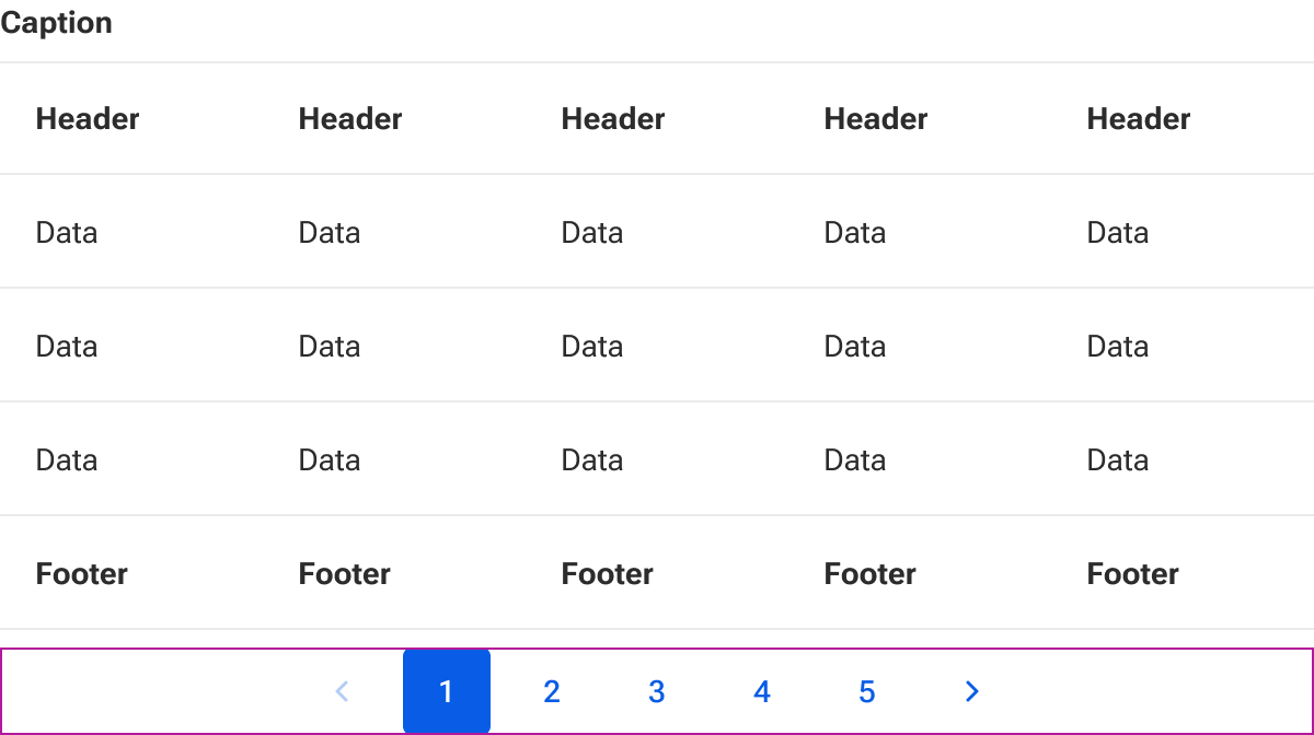
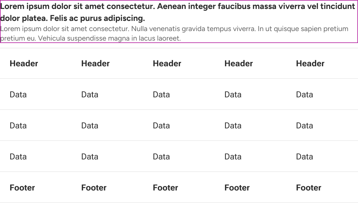
Caption slot
The caption slot is used to insert a brief descriptive summary of the table data. The slot can accept any combination of elements and content as well as custom styling to support complex layouts. By default, text that is longer than the available space within the caption slot will wrap to a new line.
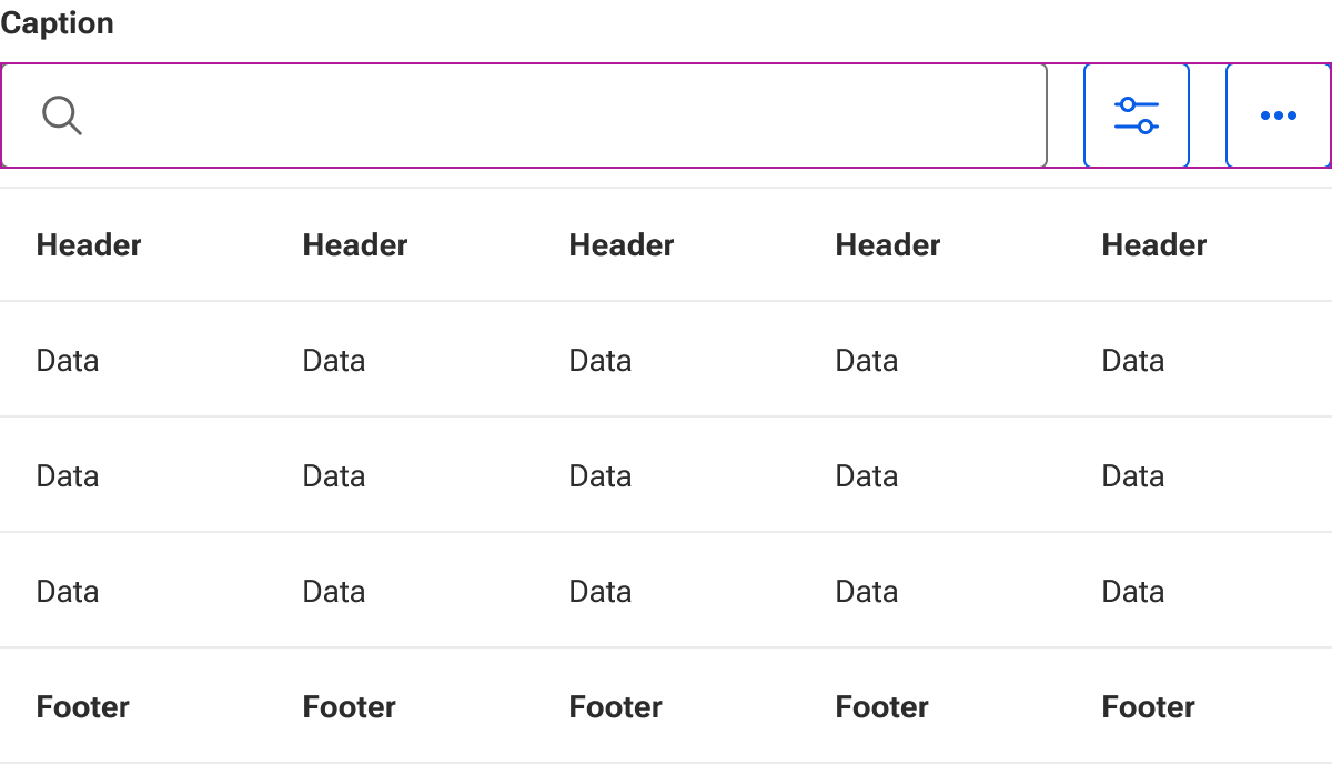
Toolbar slot
The toolbar slot is used to insert additional table functionality such as searches and filters.
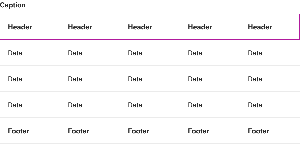
Head slot
The head slot is used to insert table rows that comprise the head of the table.
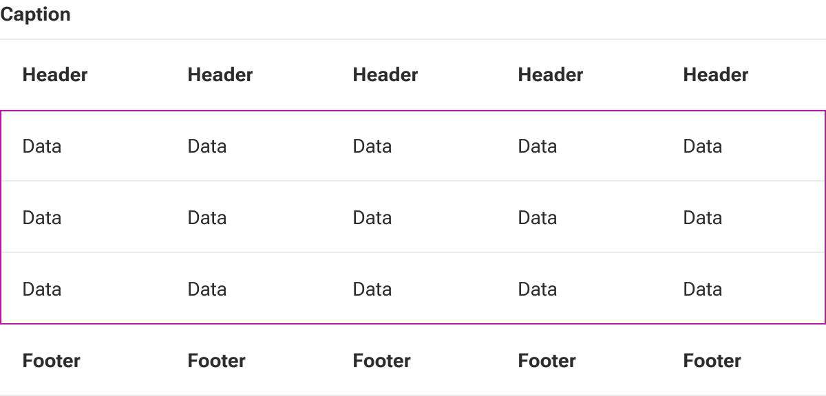
Default slot
The default slot is used to insert table rows that comprise the main data of the table.
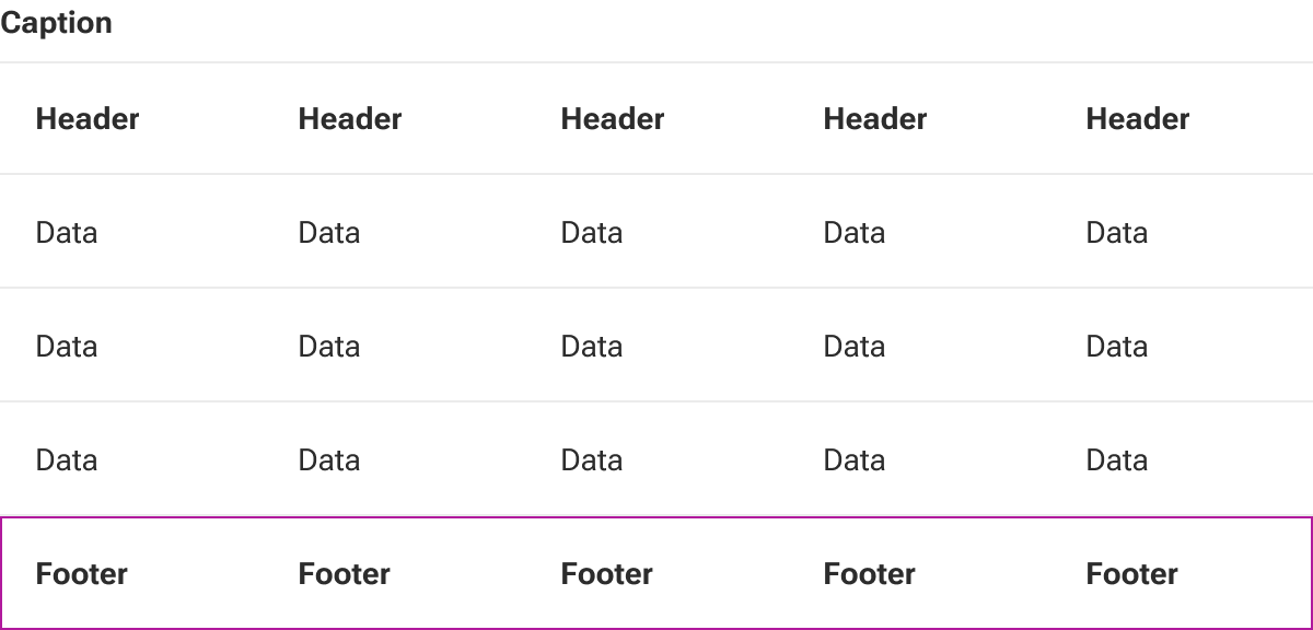
Foot slot
The foot slot is used to insert table rows that comprise the foot of the table.
Pagination slot
The pagination slot is used to insert pagination controls for handling particularly long tables.