2025: Q1
Quarter 1 at a glance—fresh drops, system glow-ups, and what’s coming next!
Fresh drops
- New components: We dropped badge, tag, tag group, and standalone pagination into the system.
- Input refresh: Added a handy clear button across all input types. No more backspacing forever!
- Switch and table upgrades: We smoothed out interactions and visual tweaks to make everyday use even better.
Behind the scenes
- Library glow-up:
- Consolidated light/dark modes into a new Theme structure in Figma
- Renamed “Core” to "Foundations" (it’s cleaner, makes more sense!)
- Streamlined how we manage v2 specs using Dev Mode and built-in annotations
- Documentation deep dive:
- Glossary launched for faster lookups
- New error messaging guidelines added
- Freshened up the look and feel across all documentation spaces
Platform and Consumer Fixes
- Platform Web love:
- Icons now consistently pull from Foundations
- Tooltip updates with helper text (perfect for shortcuts or extra hints)
- Inputs and buttons had hidden icon bugs—now squashed
- iOS readiness:
- Deep audits of Consumer iOS components are in progress
- Staying nimble ahead of Apple’s expected iOS 18 design changes
What’s next
- Tackling complex form components (like selects and other heavy lifters)
- More accessibility improvements rolling out system-wide
- Testing new design system management tools to keep scaling smarter, not harder
Cool picks from the team
-
🎲 Ransom Notes game
"Ransom Notes is pure chaos in the best way. It’s a word magnet game where you end up making the weirdest, funniest sentences. Highly recommend it for game night if you want a good laugh."
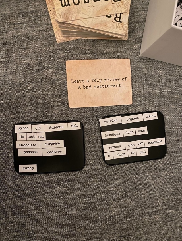
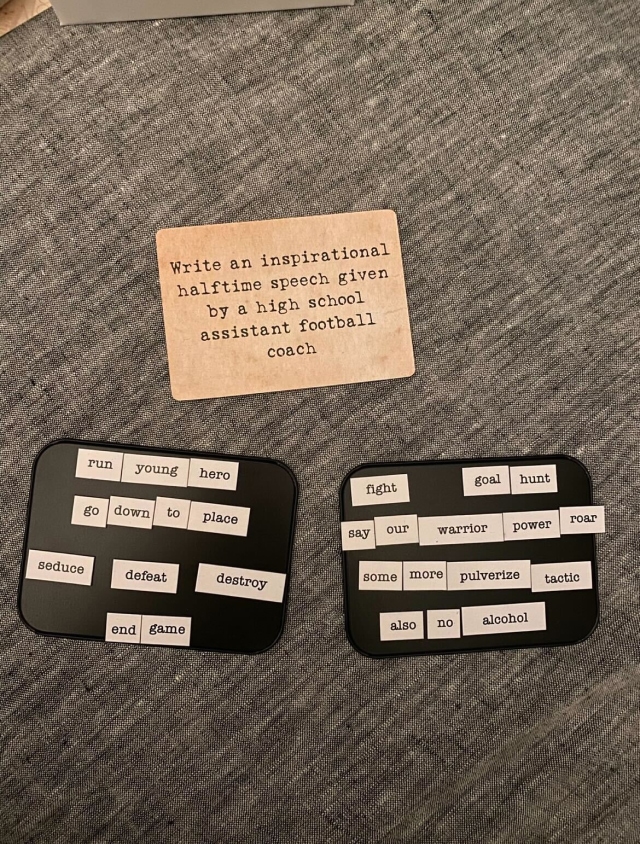
 Hanna Springer
 -
🍽️ Molly Hatch’s ceramic art
“Molly Hatch is an artist who creates large-scale installations from hand-painted ceramic plates. I’ve admired her work for years and hope to see it in person someday.”
 Yujean Park
 -
🐈 Mischief the cat**
"Mischief is this random cat who’s low-key famous in the UK for causing adorable chaos. Following him has been pure serotonin."
 Steph Hubka
 -
🪳 AntsCanada YouTube channel
“Not gonna lie—ant colonies are way more dramatic than you think. AntsCanada makes ant life feel like a reality show and it’s surprisingly addictive.”
Hanna Springer -
🥯 The Great bagel haul
“Some people bring home souvenirs from NYC. I bring back 25 bagels in vacuum—sealed Ziplocs. No regrets.”
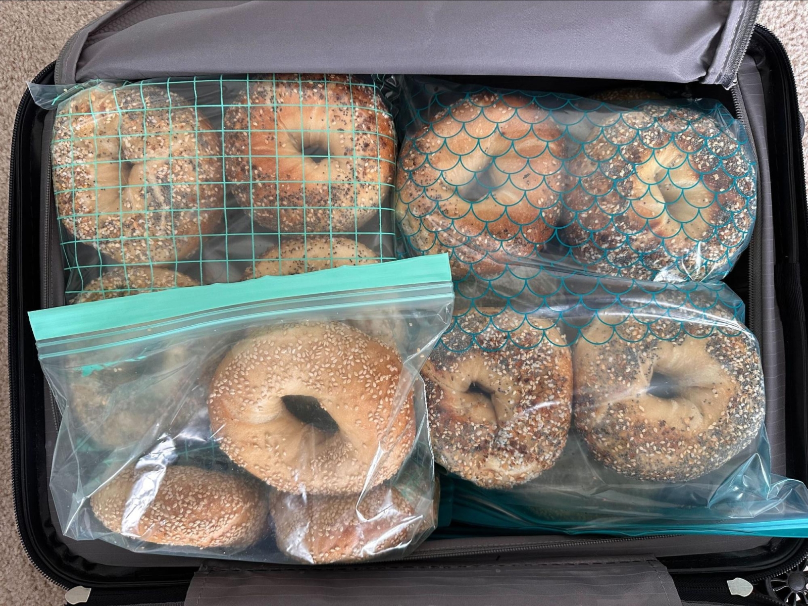 Yujean Park
 -
🎨 100 QUEST Color by Number book**
"This has been the best escape at night when I need to stop away from the computer screen. Obsessed is an understatement."
Steph Hubka -
🎶 Eclectic Playlist for Magic Night**
"I made this very eclectic playlist for a Magic: The Gathering night that [my husband] Jeremy hosted (I didn’t play—I just ran the ViBeS). It’s now my go-to work playlist because the energy is just right."
Hanna Springer