February 2025
This month, we’ve been hard at work fine-tuning the foundation of our system—standardizing processes, improving efficiency, and making everything run smoother. We also gave our documentation a much-needed refresh to make it clearer and easier to navigate. On top of that, we tackled some key updates to keep our Platform and Admin web maintenance consistent and reliable. These changes set the stage for even more improvements ahead, and we’re excited to keep things moving forward!
Base 🔵
Foundations
- Added container color aliases for neutral, brand, positive, and negative colors.
- Integrated color variable references into gradient styles for consistency.
- Linked font variable references to typography styles for improved alignment.
- Introduced the
opacity.disabledvariable for better accessibility control. - Added missing token descriptions and standardized code syntax for clarity.
Components
- Implemented components for: badge, tag, and tag group
- Incorporated opacity variables (where applicable)
Library/architecture
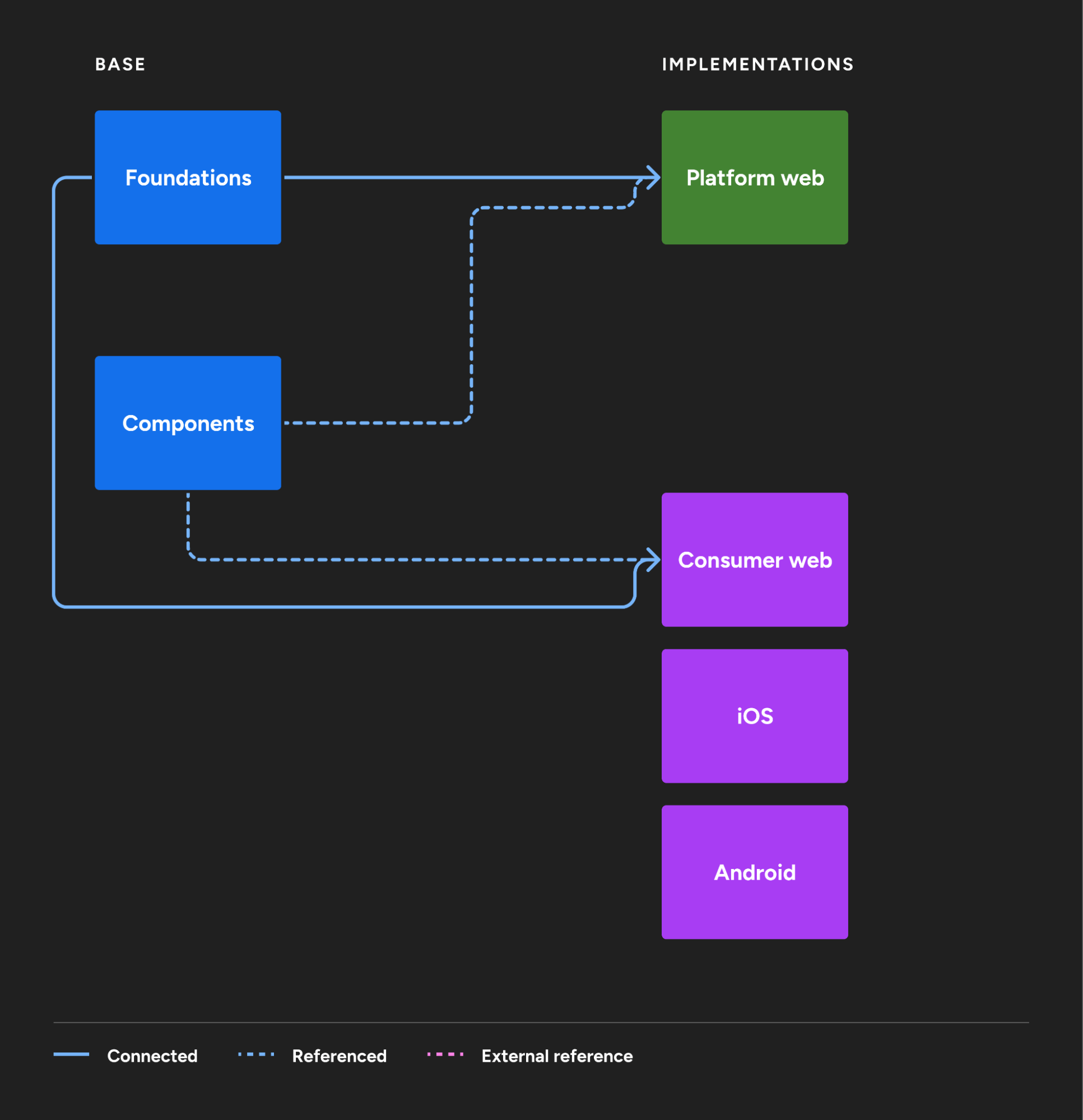
We conducted an internal exercise to map out our Figma library architecture, identifying which design components were utilizing specific code packages. This process helped us visualize dependencies, streamline our design-to-development workflow, and ensure consistency across our assets. By mapping these relationships, we gained a clearer understanding of where redundancies or inefficiencies existed, allowing us to optimize our library structure for better scalability and maintainability.
As a result of this exercise, we implemented several updates to improve clarity and organization.
- Renamed the Core library to Foundations to better reflect its purpose as the base of our design system.
- We consolidated our Icon assets by moving them from the separate icons library into the newly named Foundations library, ultimately removing the standalone icons library to streamline our system.
These changes enhance the structure and maintainability of our Figma libraries while improving efficiency for both design and development teams.
Documentation & guidelines
- Restructured content architecture to clearly distinguish the base system from product-specific implementations. This included adding a link to the Platform web documentation site for easier access.
- Updated the About section and other background information to provide clearer context on the system.
- Introduced a glossary to define key terms and improve consistency.
- Added guidelines for writing error messages to ensure clarity and usability.
- Overhauled and standardized grammar and mechanics guidelines for consistency across the documentation.
- Refreshed overall styling of the documentation site for a more polished look and improved readability.
- Streamlined the design token lists, consolidating all tokens within a given theme—both global and alias—onto a single reference page.
Contribution workflow
We’ve made some process improvements in regards to the design contribution model, which is a structured flow for modifying or adding new elements in the Jack Henry design system. This model standardizes practices, ensuring that the design system evolves in a consistent and controlled manner.
Internally, we’ve enhanced this process to make it more transparent, efficient, and inclusive for our teams. By streamlining submission workflows, providing clearer guidelines, and improving collaboration channels, we’ve made it easier for employees to contribute their ideas and enhancements. These improvements ensure that every designer has a voice in shaping our design system while maintaining quality and consistency across all contributions.
If you’re looking for code updates or references, be sure to check our Storybook link for the latest components and design system guidelines.
Platform 🟢
Components
- Fixed tab and tab bar cut-off issue with long text
- Unified styling by aligning all fonts, paddings, and borders with Platform web tokens
- Added new secondary navigation tool icons
Admin web (maintenance)
- Roboto has been reintroduced while maintaining the same naming conventions as the Base library’s previous references (all lowercase, rather than sentence case like the rest of Admin web).
- Refined the Conversations microcopy component for easier customization, including a new blocked device variant. Now, updating names, devices, and timestamps is much simpler—no more manually typing that pesky dot.
- Message bubbles now support a toggleable max-width. The Conversations composer has been updated with video and AI icons, a placeholder row beneath typed text, and significantly improved functionality. Plus, the auto layout issue for the mode switcher is finally fixed!
- Updated the Support Inbox example screen to properly adjust when the composer height changes.
- Three new noun variants added: ACH, Wire, and chooseNoun.
Documentation & guidelines
- Added Avatar component documentation
- Added Content documentation that mimics guidelines from the base system
What’s next? 🔮
Next up for our design system, we’re focusing on expanding our documentation resources to provide clearer guidance and better usability. We’ll be improving our existing component library, refining accessibility practices, and making overall design updates to .design to create a more streamlined experience for our users. Additionally, we’re working on publishing our base libraries to our Figma Community page, making them accessible to the general public for broader adoption and usage.
Our Consumer platform, including Web, iOS, and Android, has been utilizing its current structure and library systems effectively. While Web and Android will continue to use their respective libraries, we’re exploring potential changes to iOS. We’re collaborating with the iOS team to explore the integration of Apple’s latest iOS 18 library releases, ensuring our mobile app design and development remain cutting-edge and optimized for the newest capabilities.
This shift is essential because the iOS library from Figma provides a readily available set of pre-designed components, styles, and layouts that closely match the native iOS interface. By leveraging this library, we can quickly and effectively design for iOS apps with a consistent look and feel while adhering to Apple’s Human Interface Guidelines. This not only reduces design time but also ensures our designs align with platform standards.
Although Web and Android will continue using their current libraries, our overarching goal remains the same—utilizing the Jack Henry design system and native components wherever possible to create a cohesive, high-quality experience across all platforms. Stay tuned for more details!
Cool stuff from us 😎
-
“This 100 QUEST Color by Number book has been the best escape at night when I need to step away from the computer screen. Obsessed is an understatement.”
 Steph Hubka
 -
“I made this very eclectic playlist for a Magic: The Gathering night that [my husband] Jeremy hosted for a few friends (I did not partake, I’m just in charge of the ViBeS), but found myself returning to the playlist afterwards because it has good getting-work-done energy.”
 Hanna Springer
 -
“Molly Hatch is an artist who creates large scale installations from hand-painted ceramic plates. I’ve admired her work for years and hope I can see it in person someday.”
 Yujean Park